Ate Nene’s
Brand identity
Brand identity, marketing design, poster art, print and merchandise, UI/UX.
01 / The portfolio
Identity systems, campaigns, and tactile pieces.
A selection of client work and creative explorations.
Brand identity
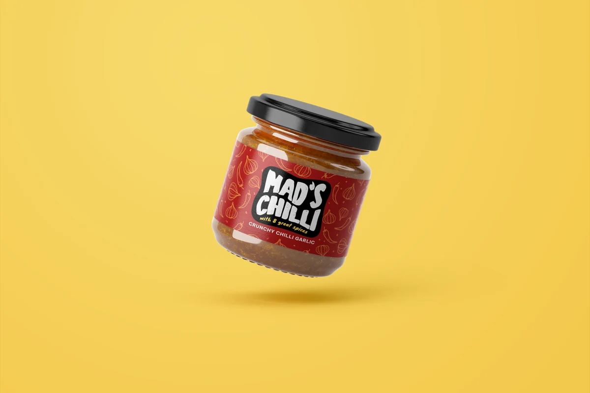
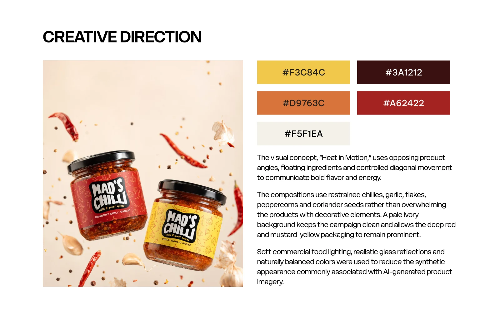
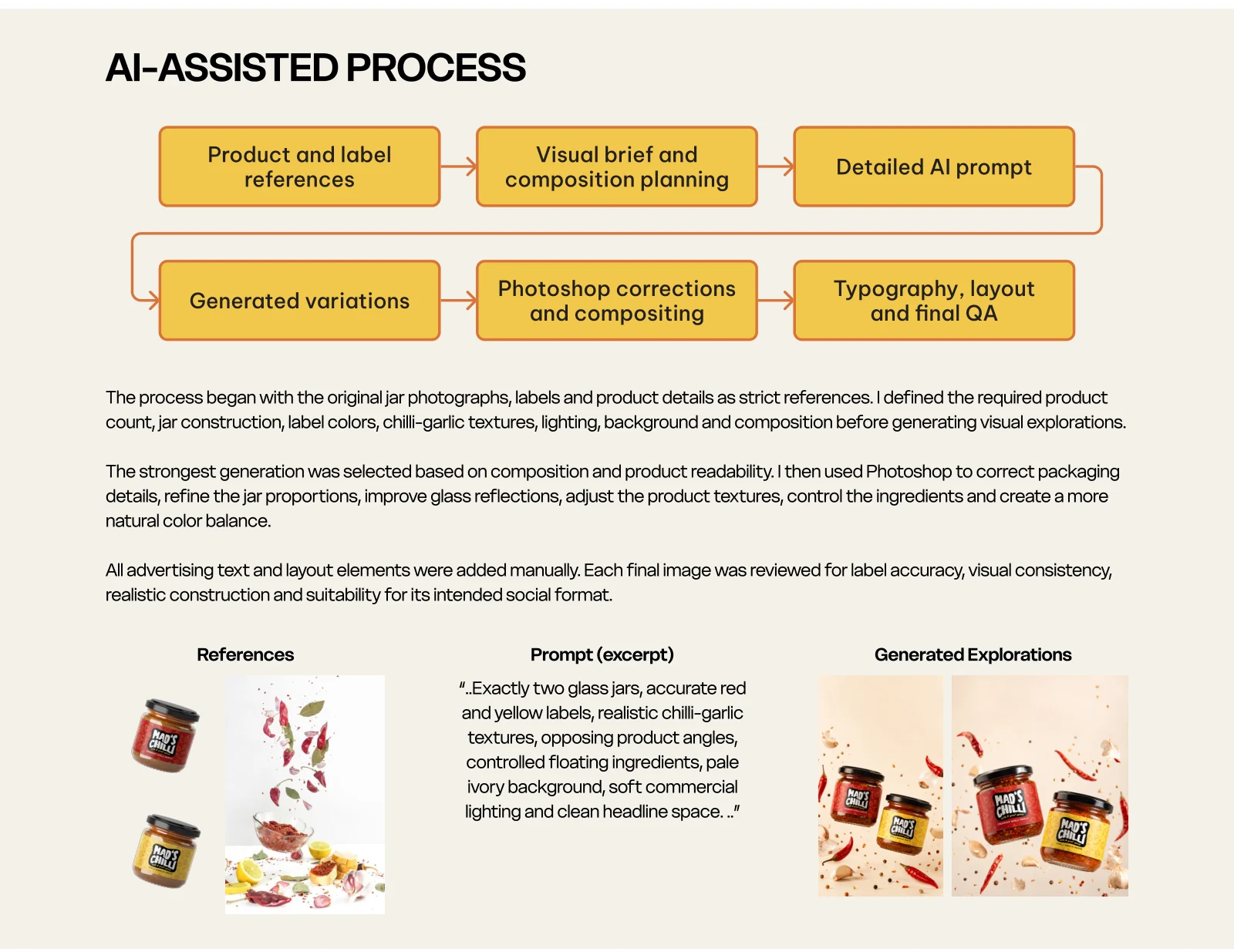
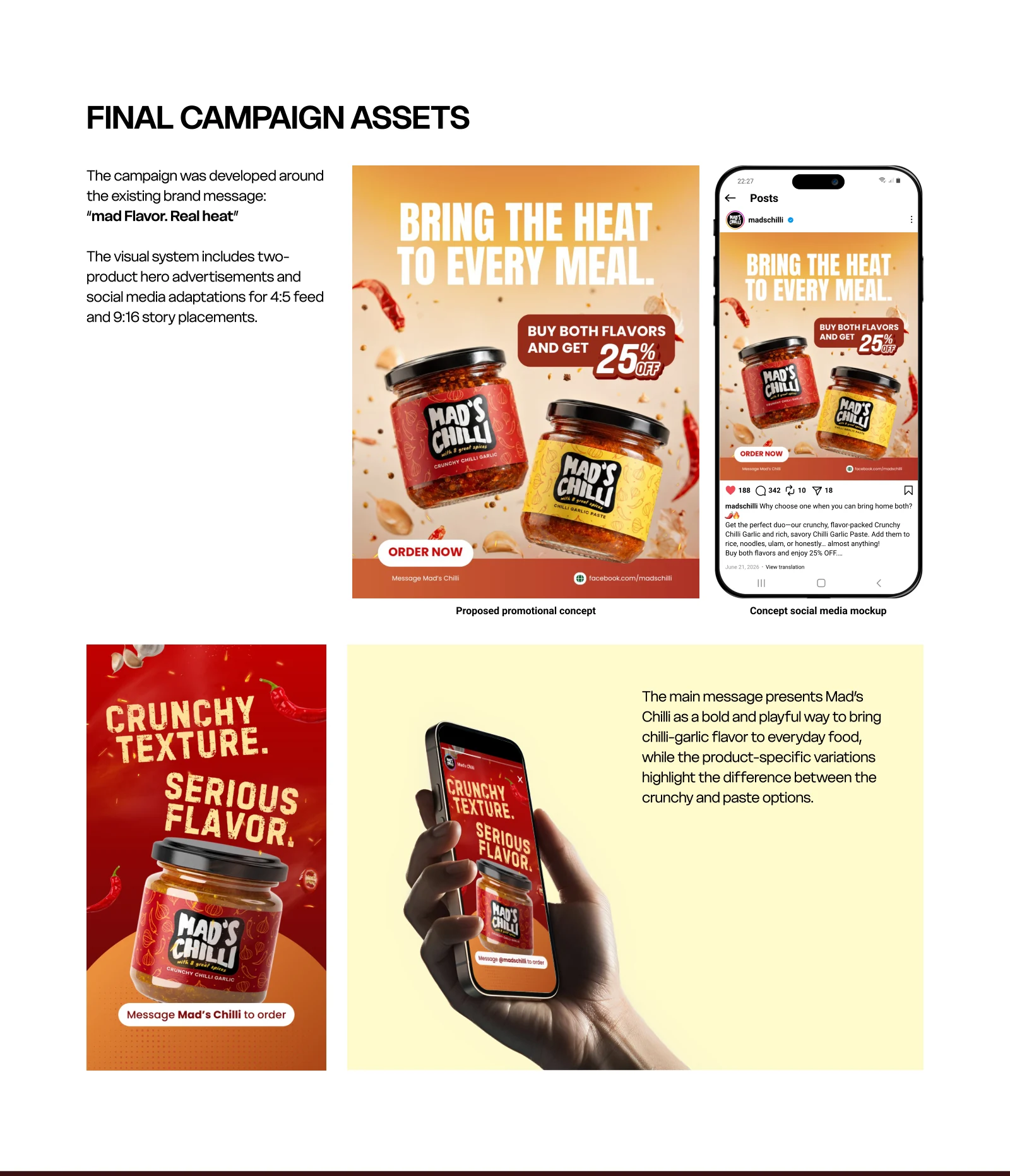
AI-assisted social campaign concept

Brand identity
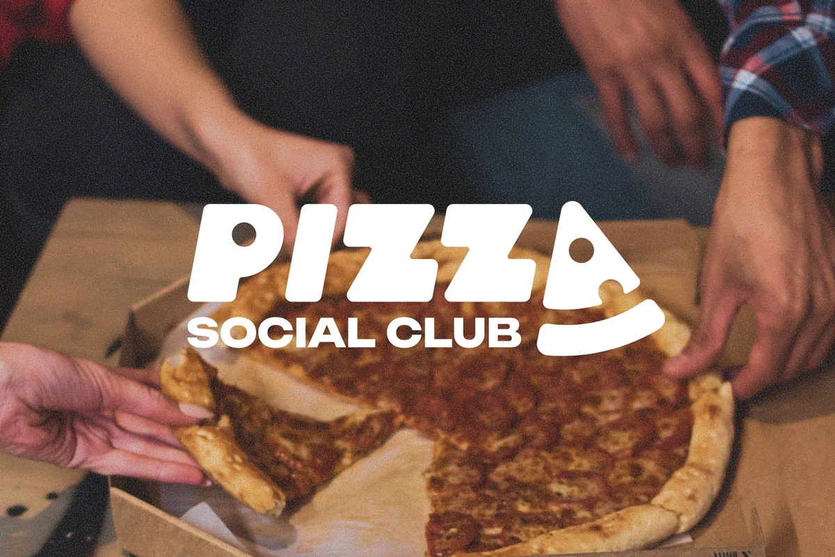
Logo design & visual identity
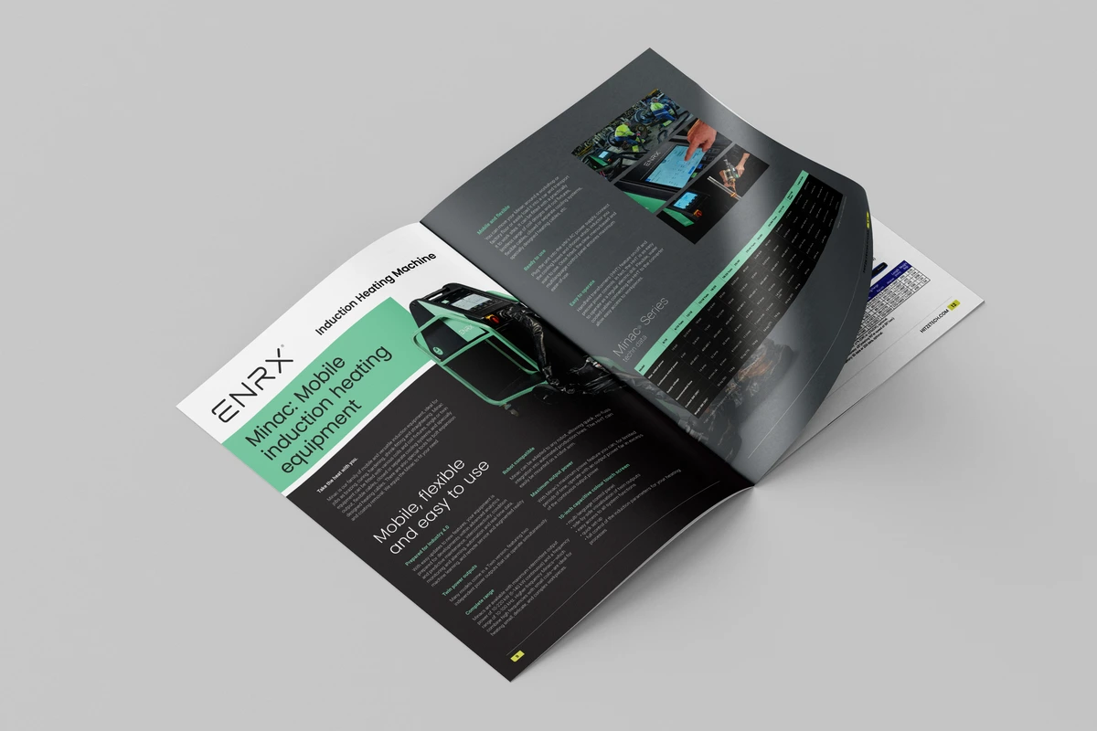
Editorial / Brochure Design
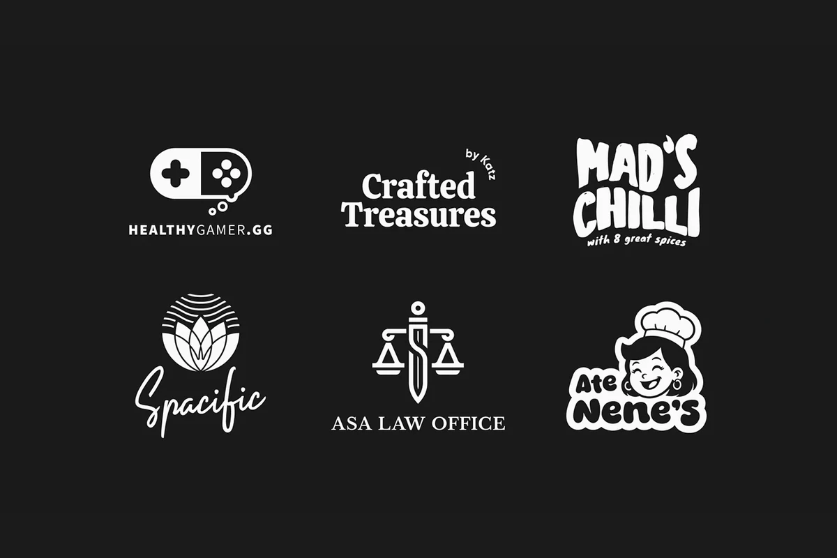
Logo collection
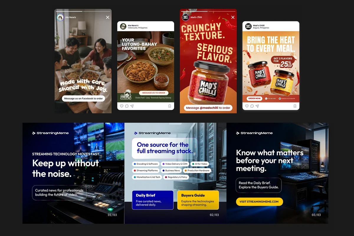
Social & campaign
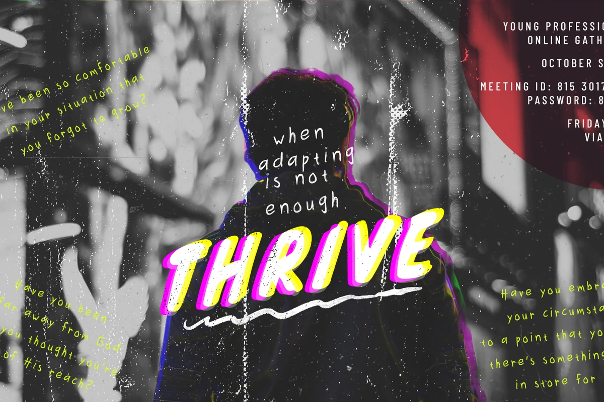
Church event & message art
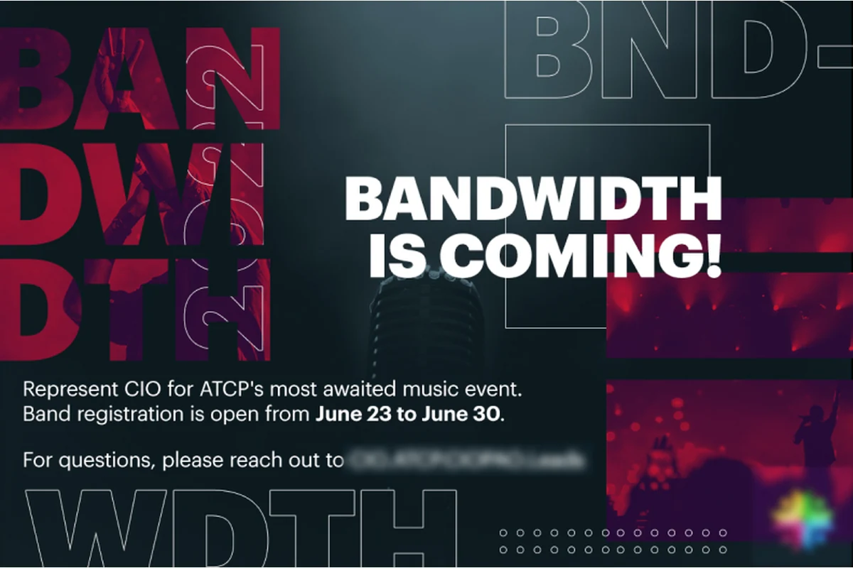
Email & digital campaigns
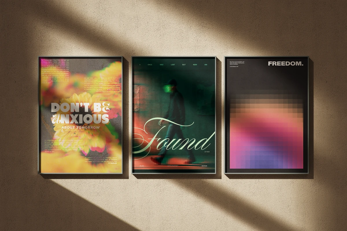
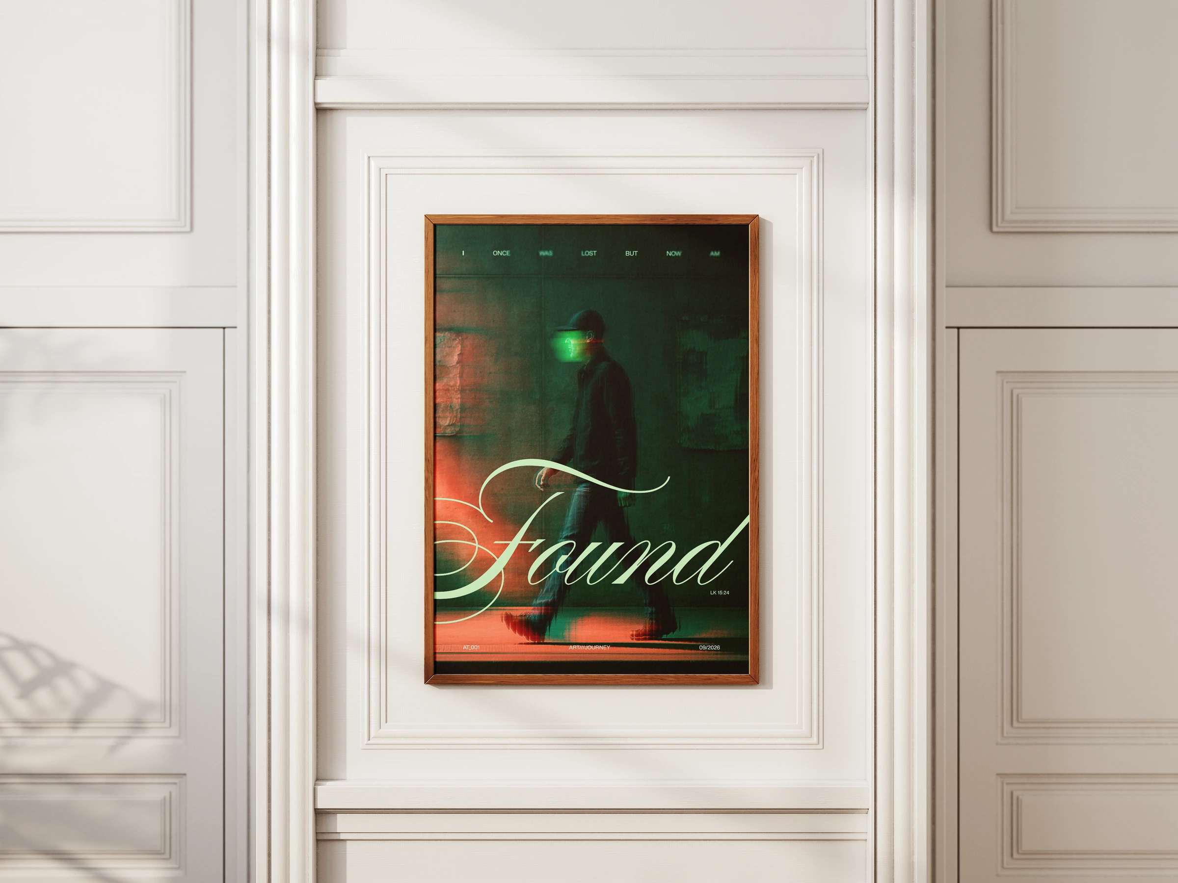
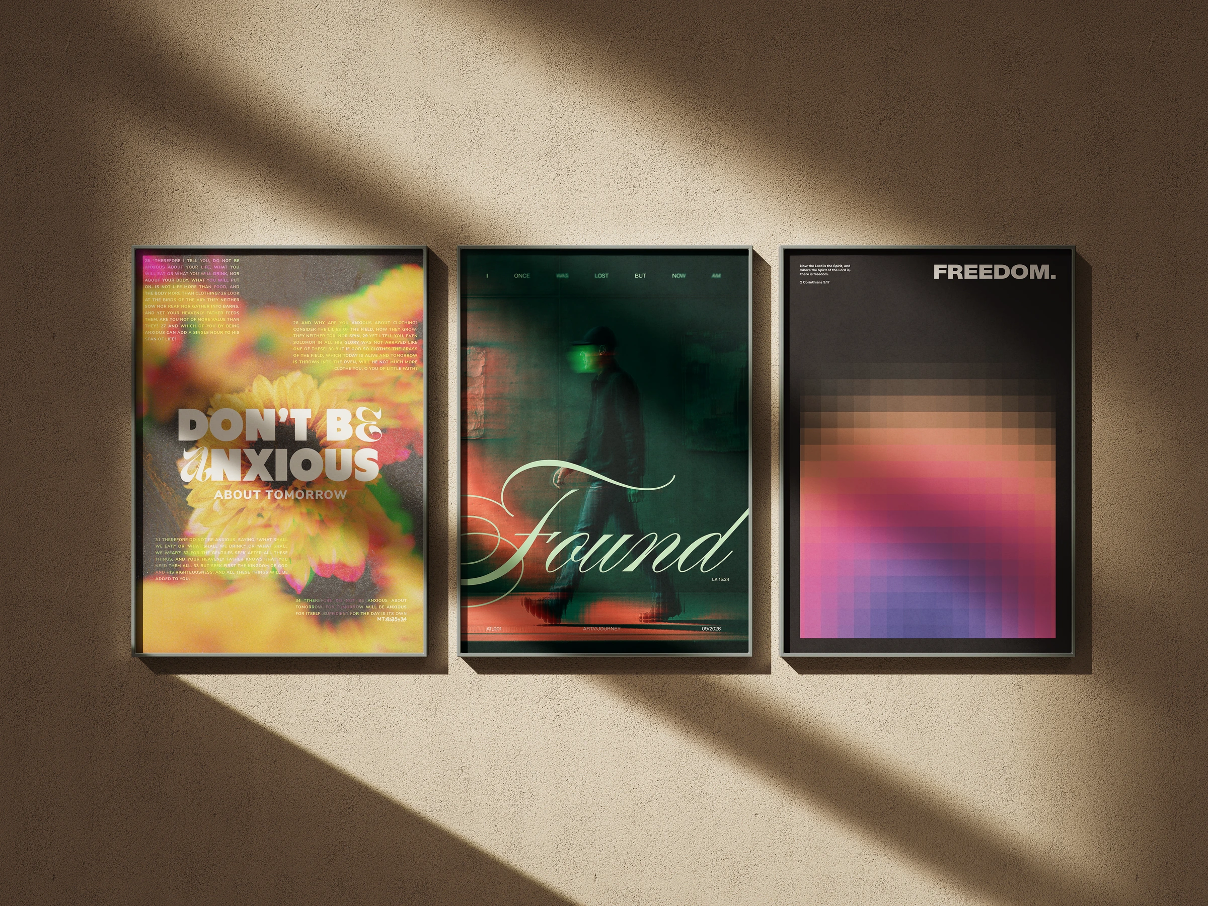
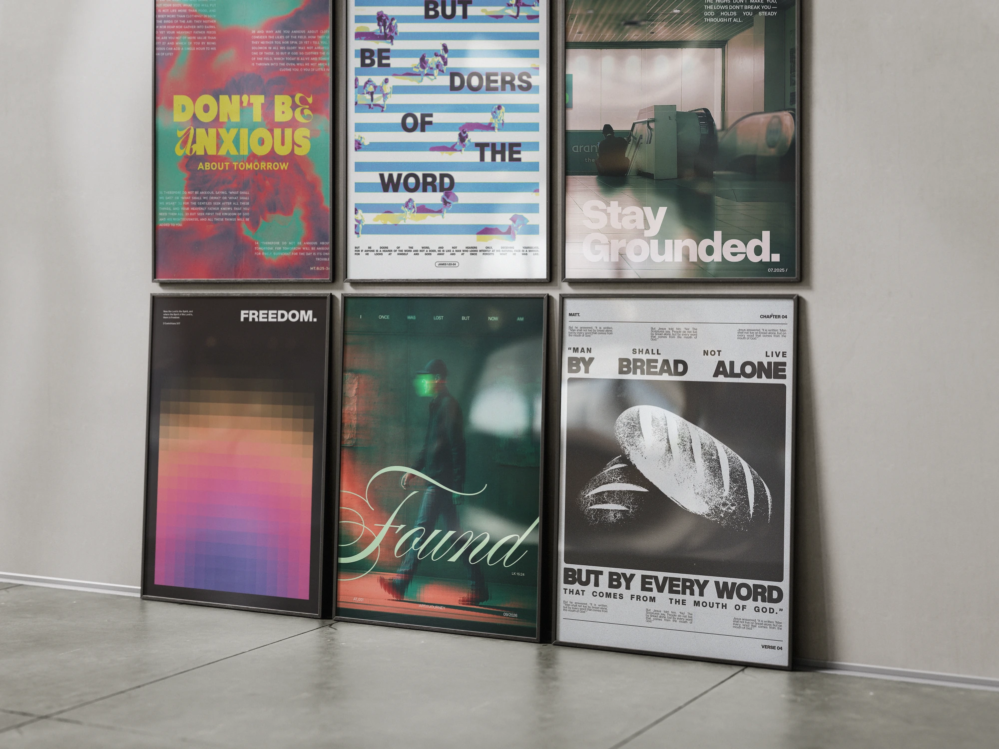
Poster art & prints
UI/UX Design / Coming soon
I’ve also worked on UI/UX projects at Accenture. Those stories aren’t here yet—take a look at my graphic design work while I get them ready.
Explore graphic design02 / A little about me
A graphic and brand designer based in Valenzuela, Philippines. I create identity, marketing, and print work—moving from the big idea to the smallest production detail.
Brand identity
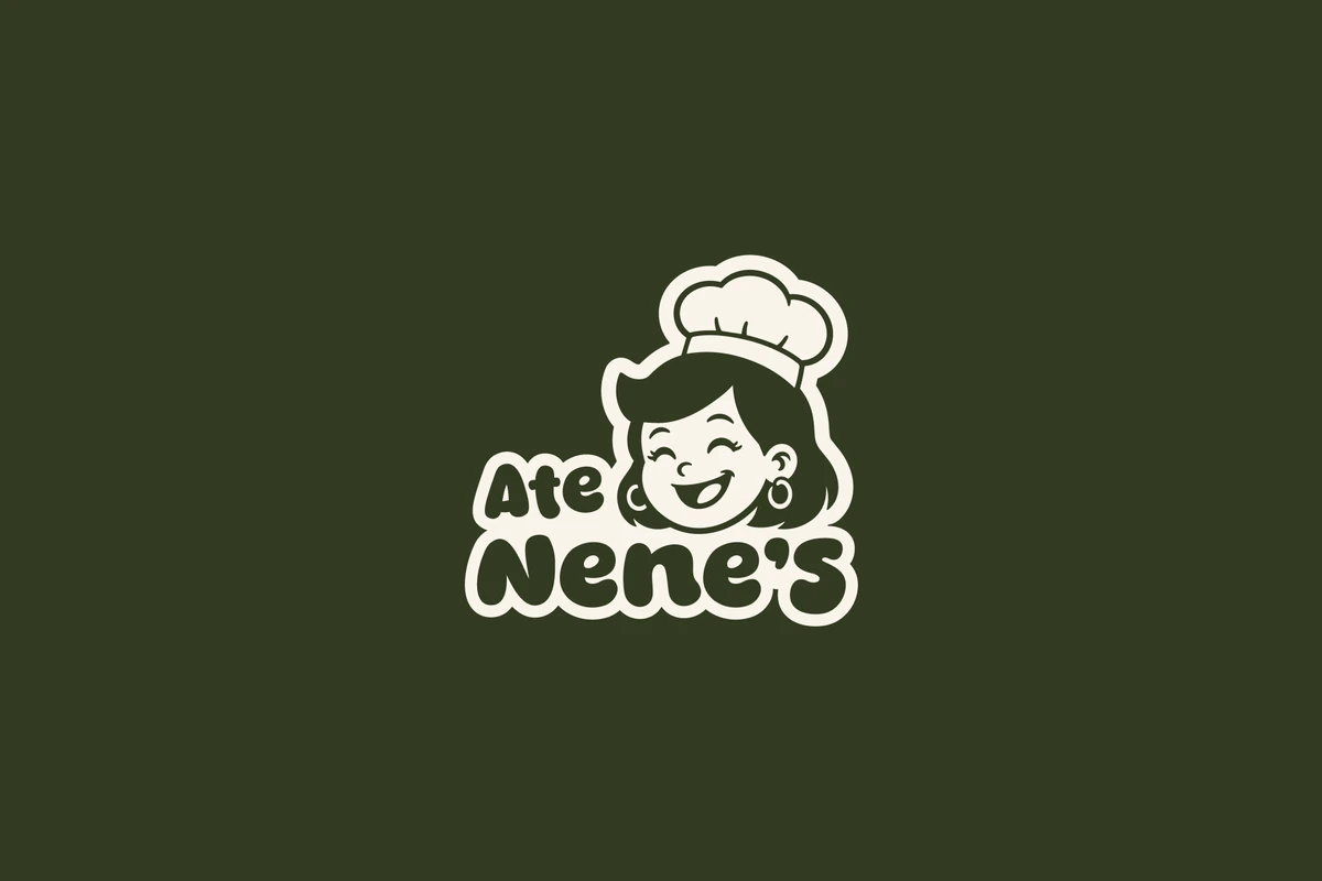
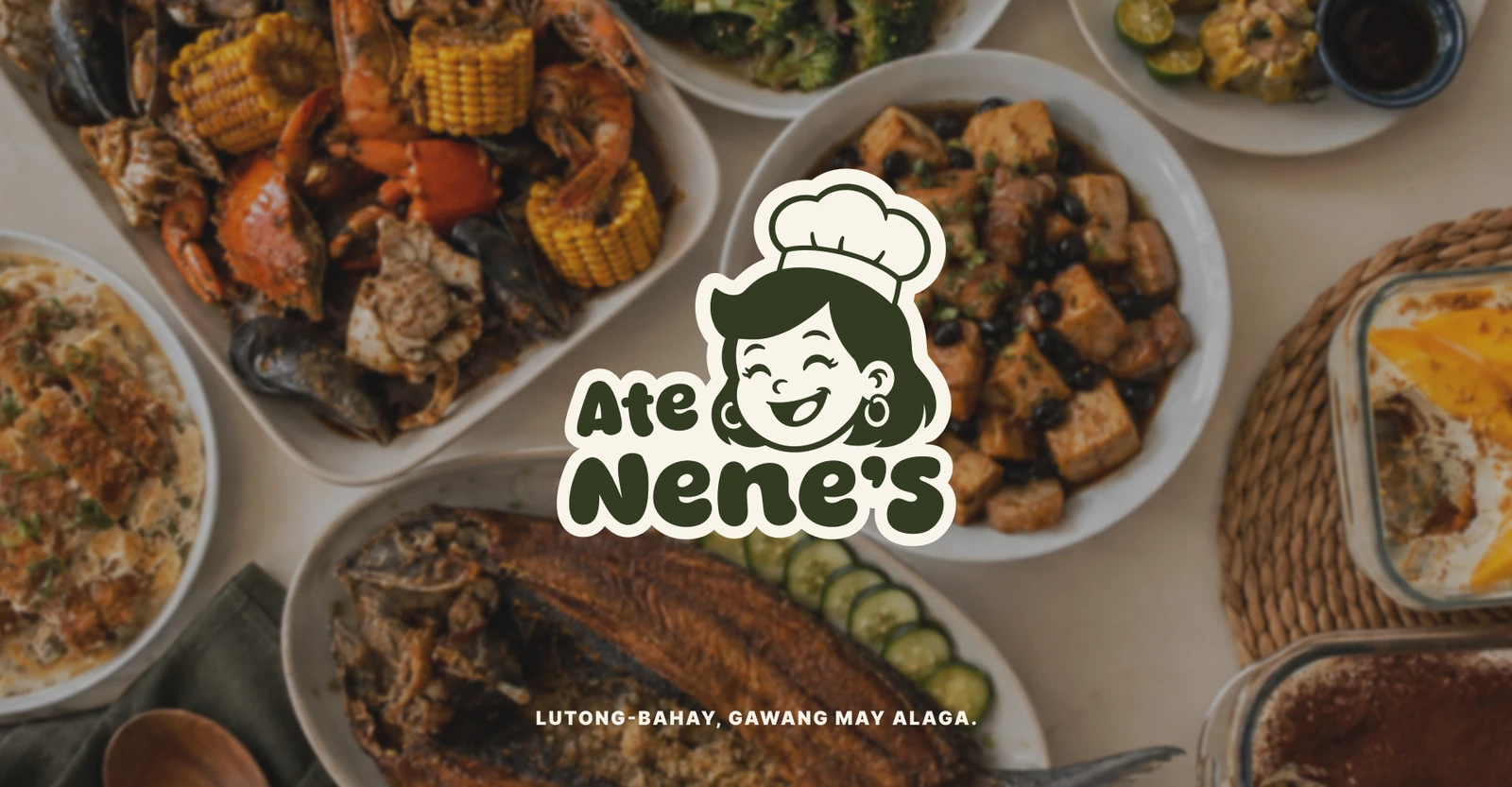
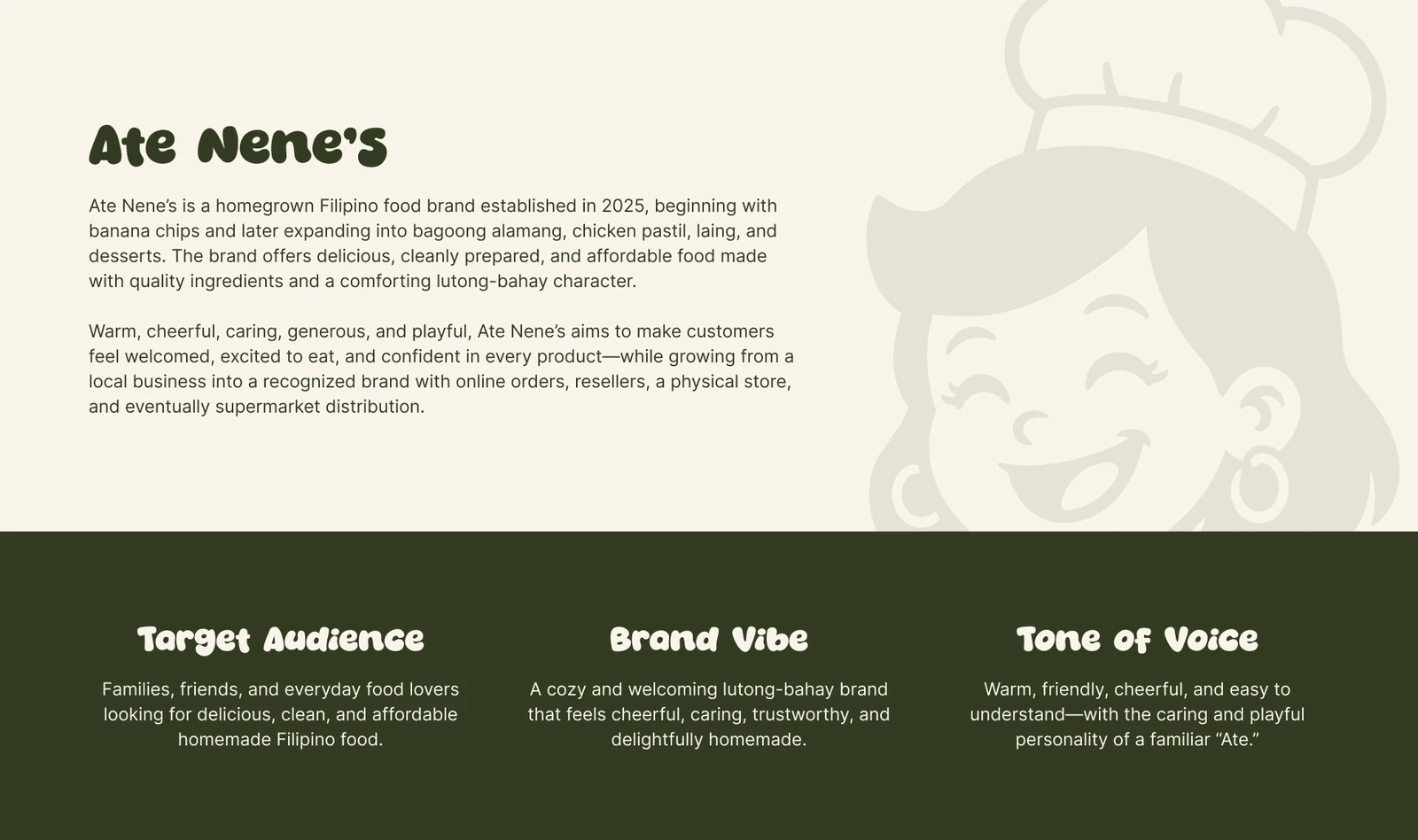
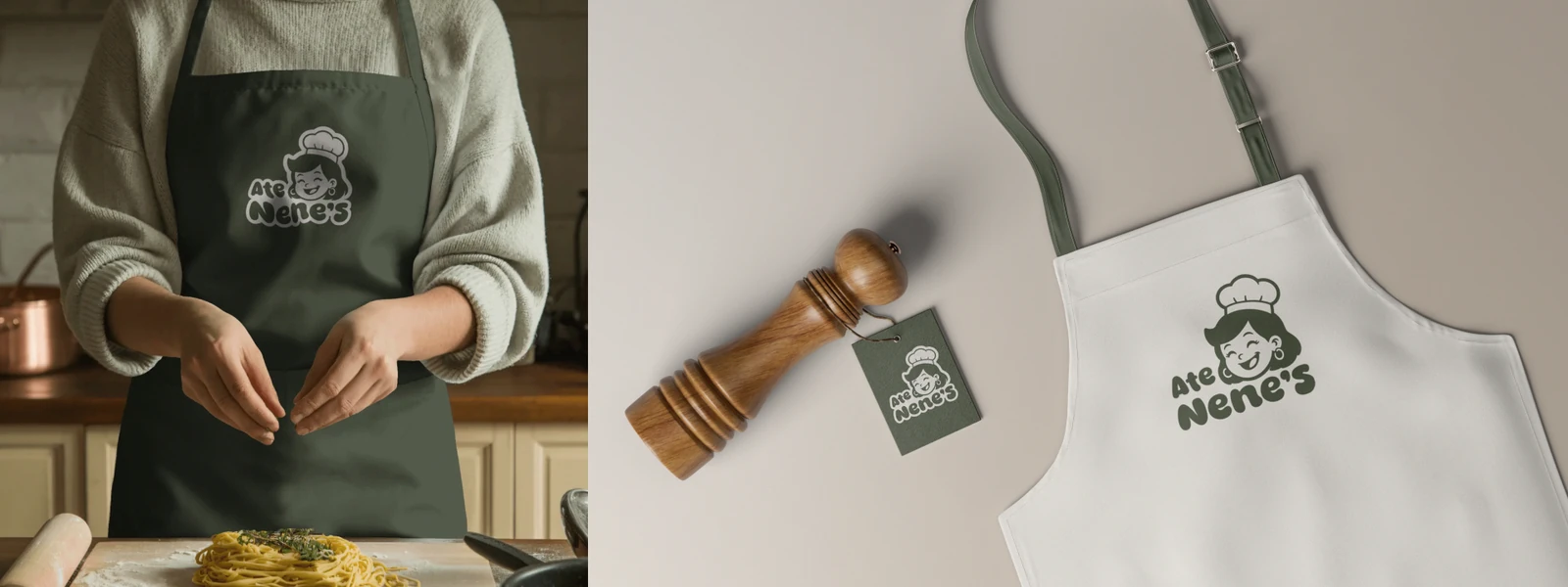
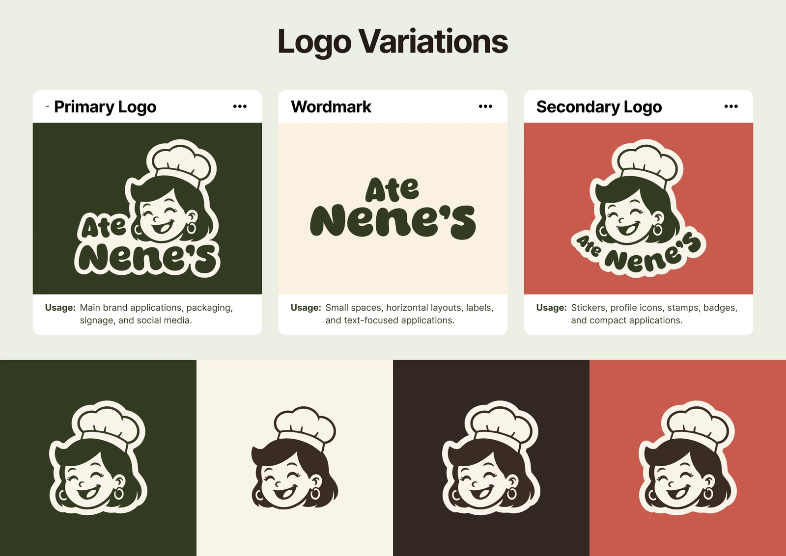
A warm, playful visual identity for a homegrown Filipino food brand. A chef mascot, expressive wordmark, earthy palette, and food-focused applications reflect its caring, lutong-bahay character.
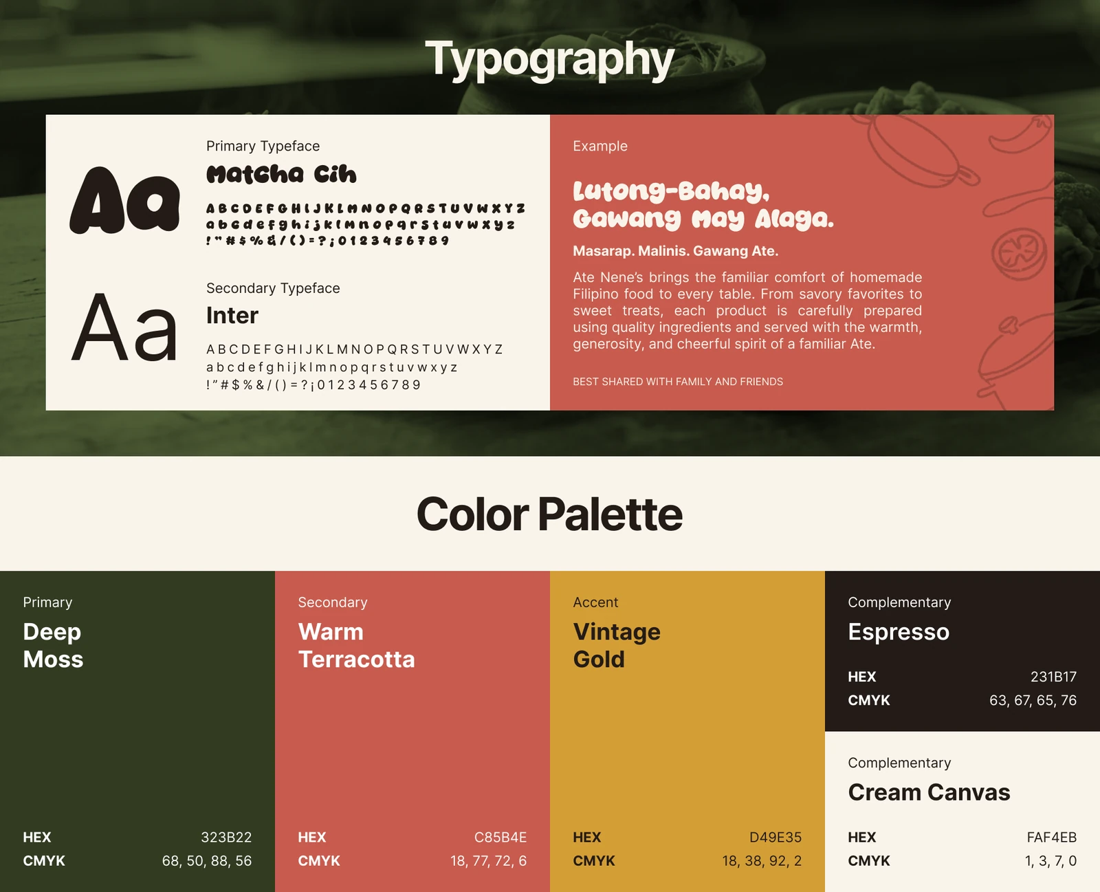
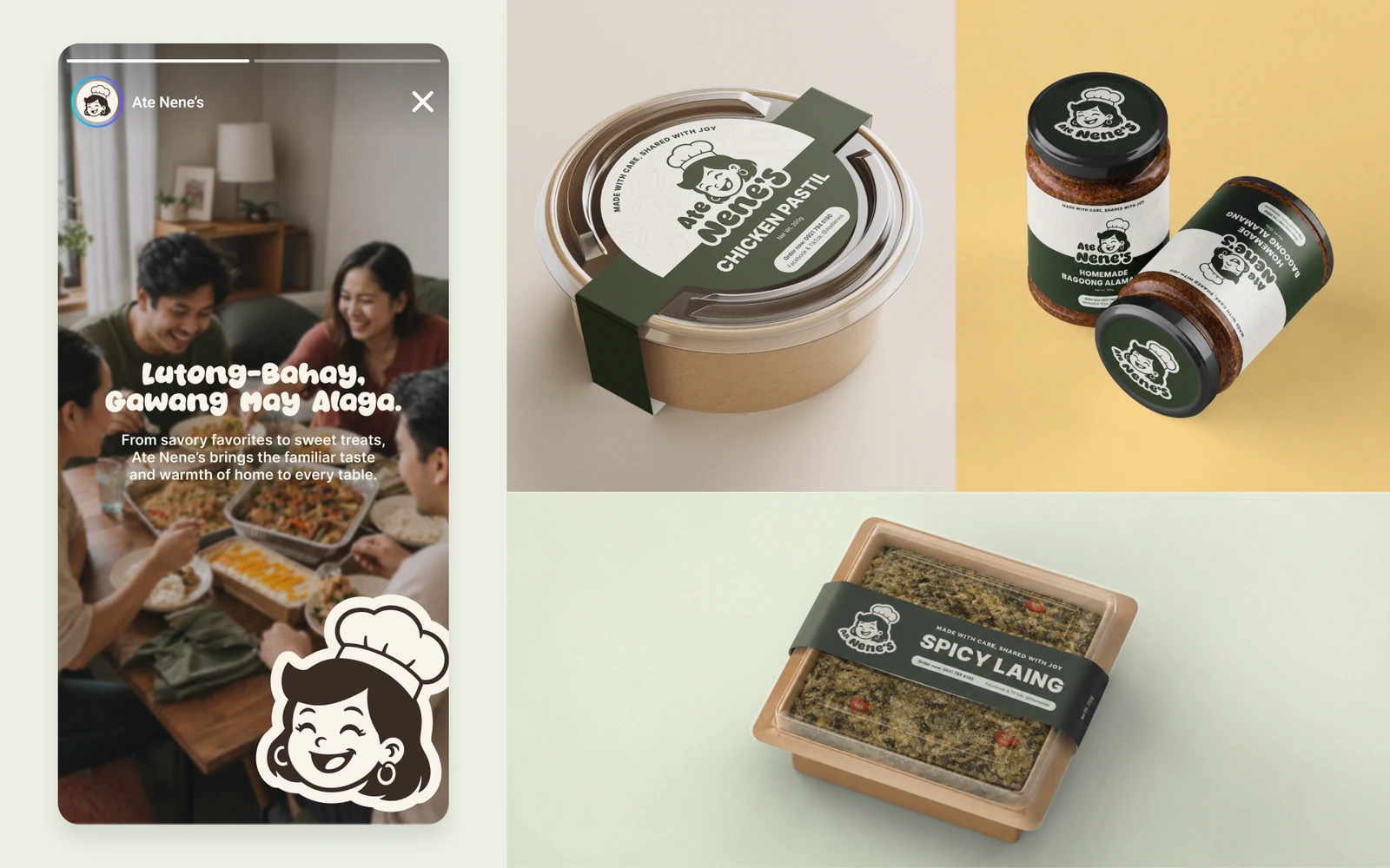
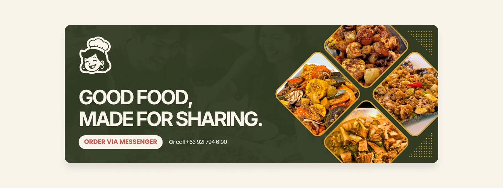
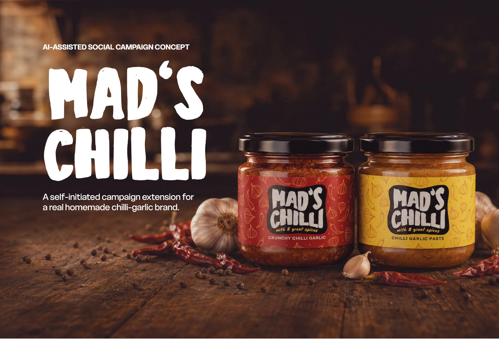
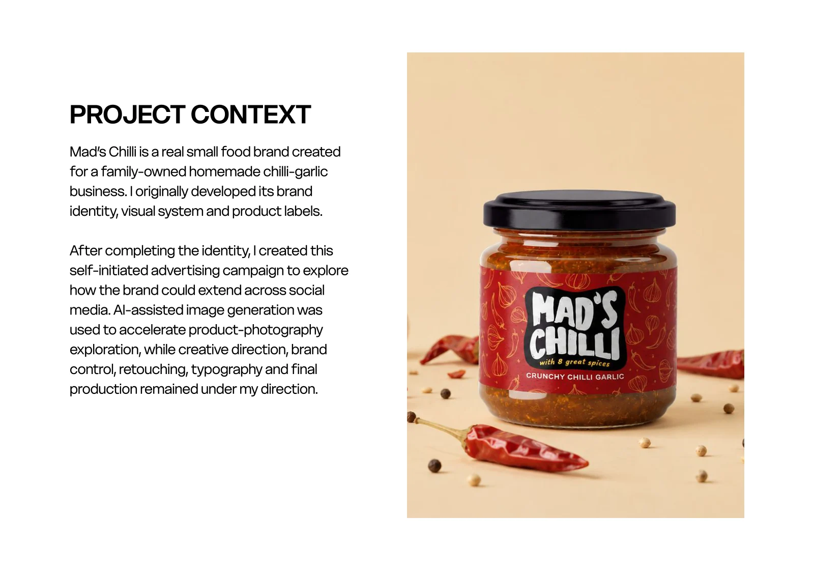
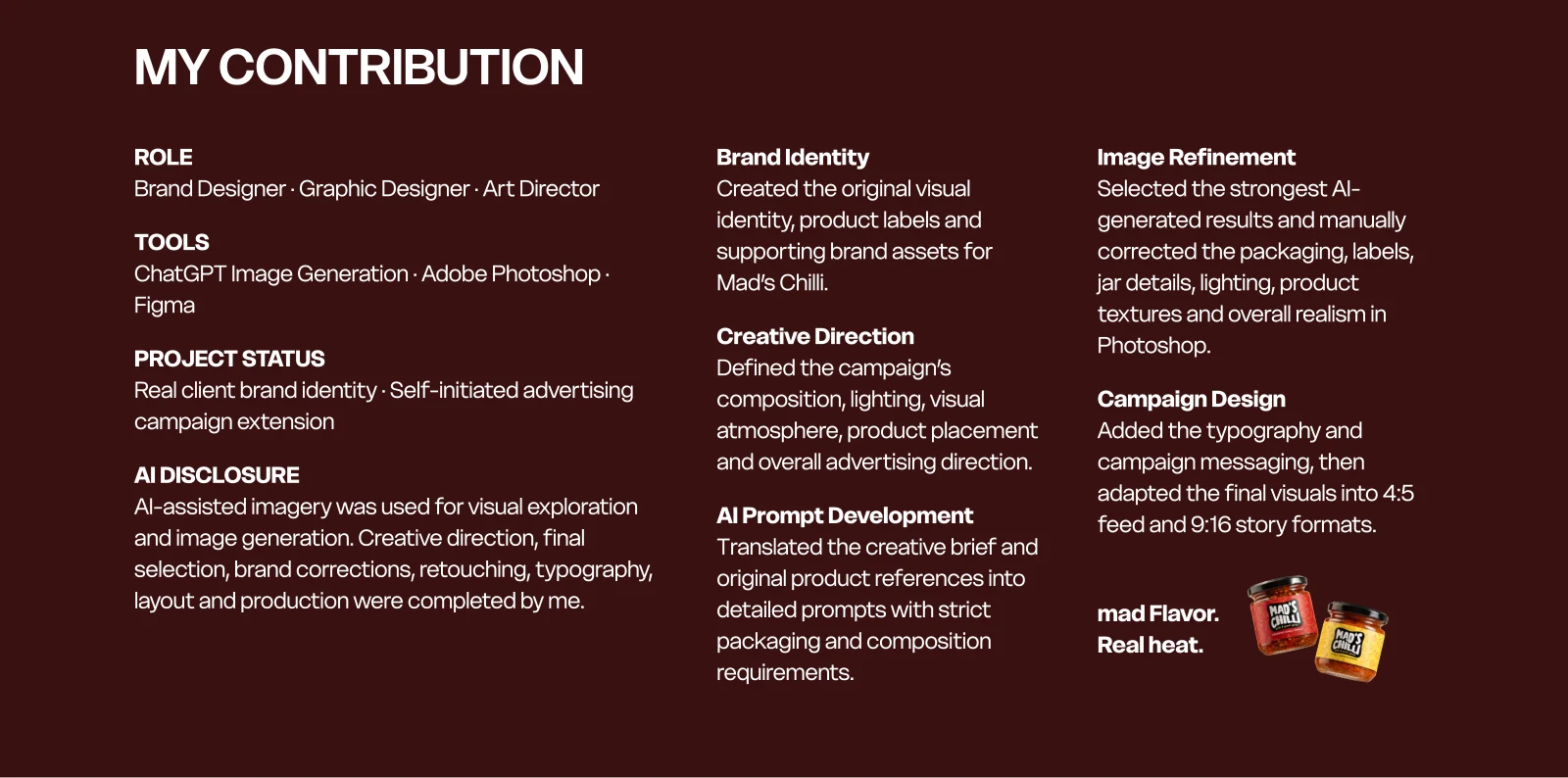
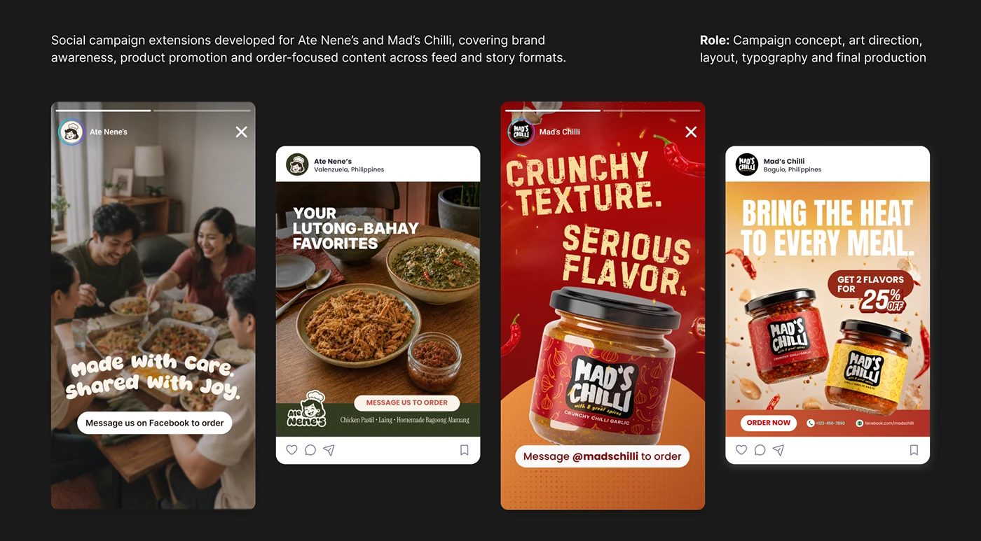
AI-assisted social campaign concept
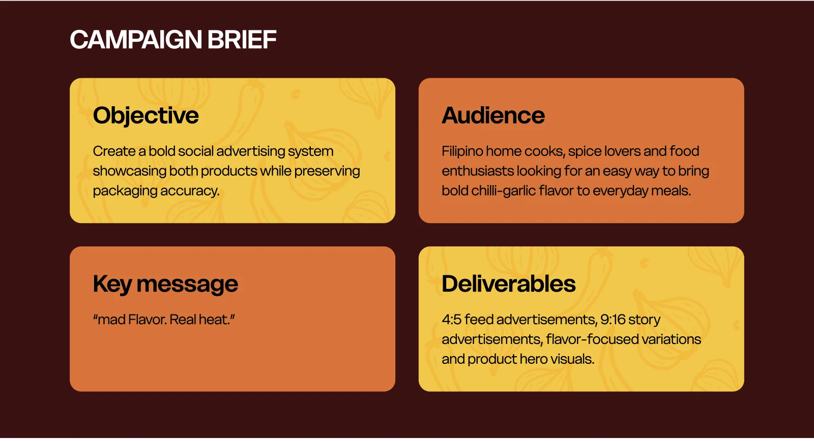
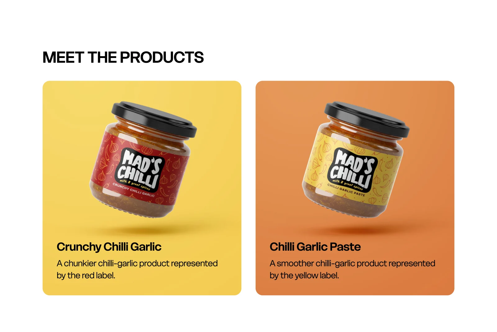
A self-initiated, AI-assisted social advertising concept extending an existing homemade chilli-garlic brand. Product-reference-led imagery, art direction, retouching and manually composed typography explore feed and story formats; no campaign performance or publication outcome is claimed.
Brand identity
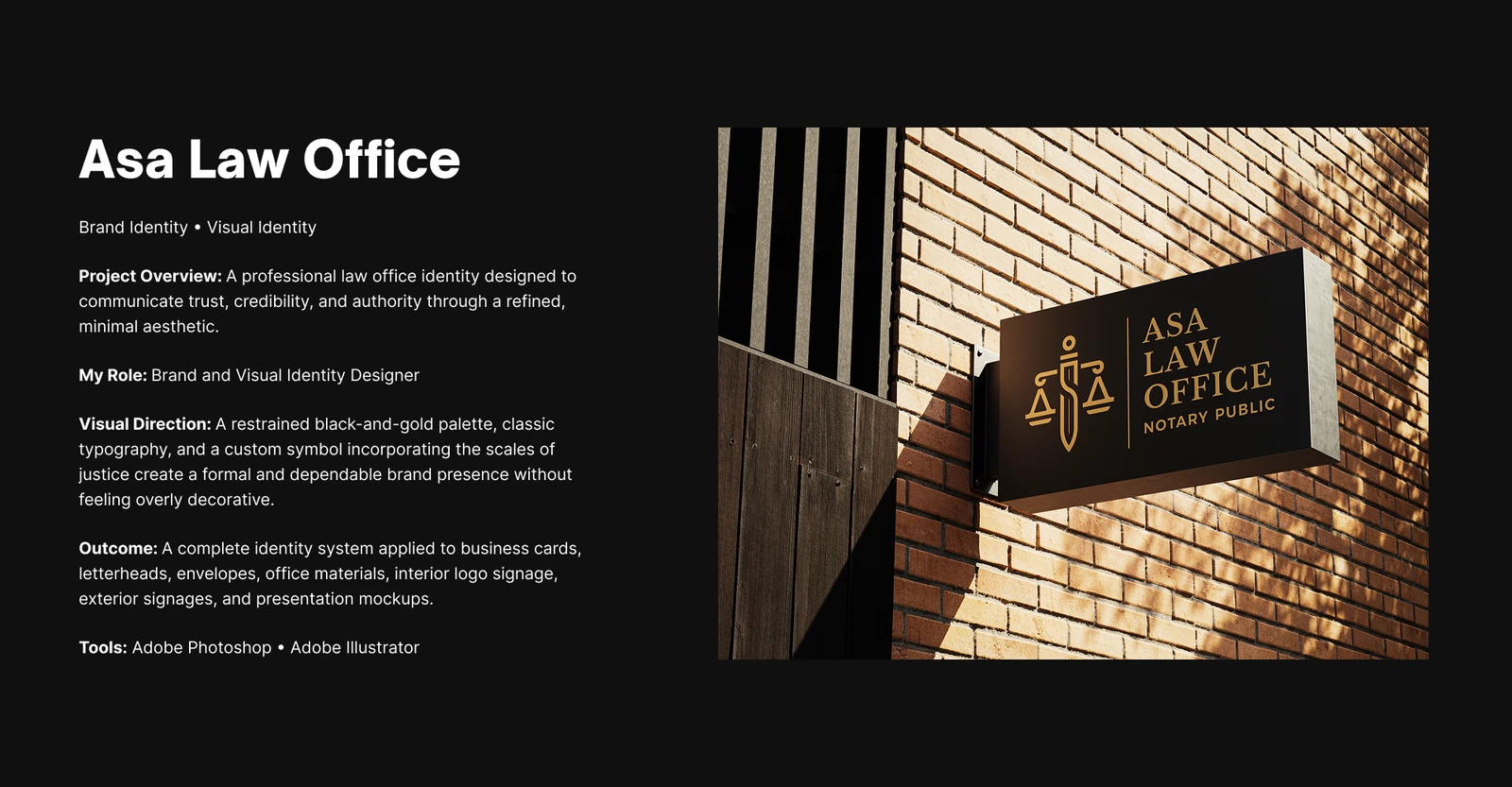
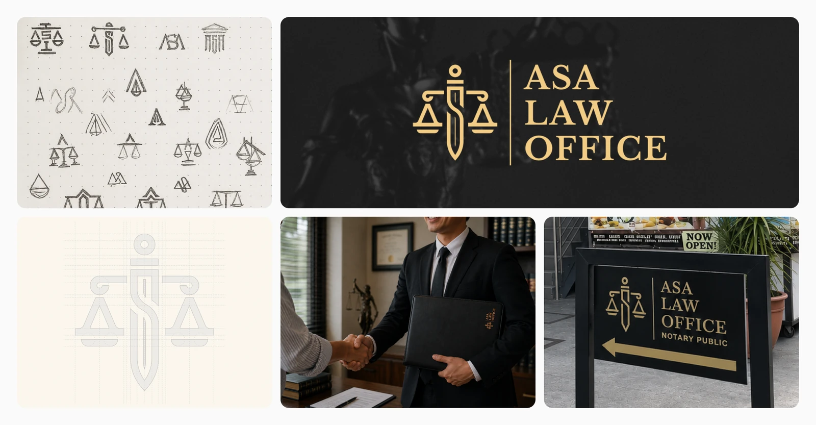
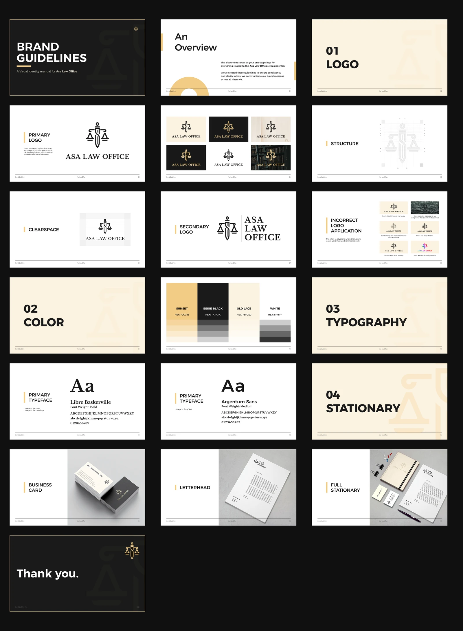
A restrained black-and-gold identity for a law office, developed across logo design, signage, stationery, and brand guidelines.

Logo design & visual identity
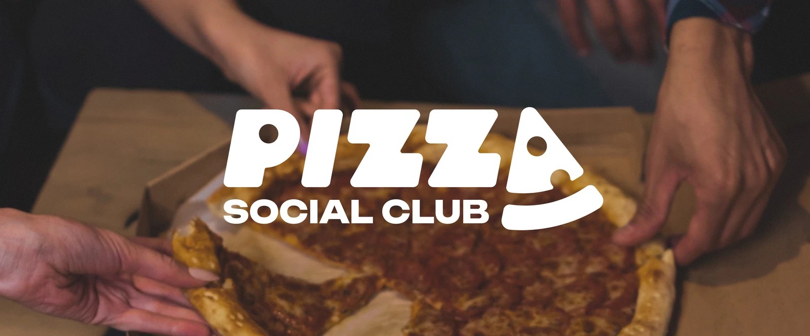
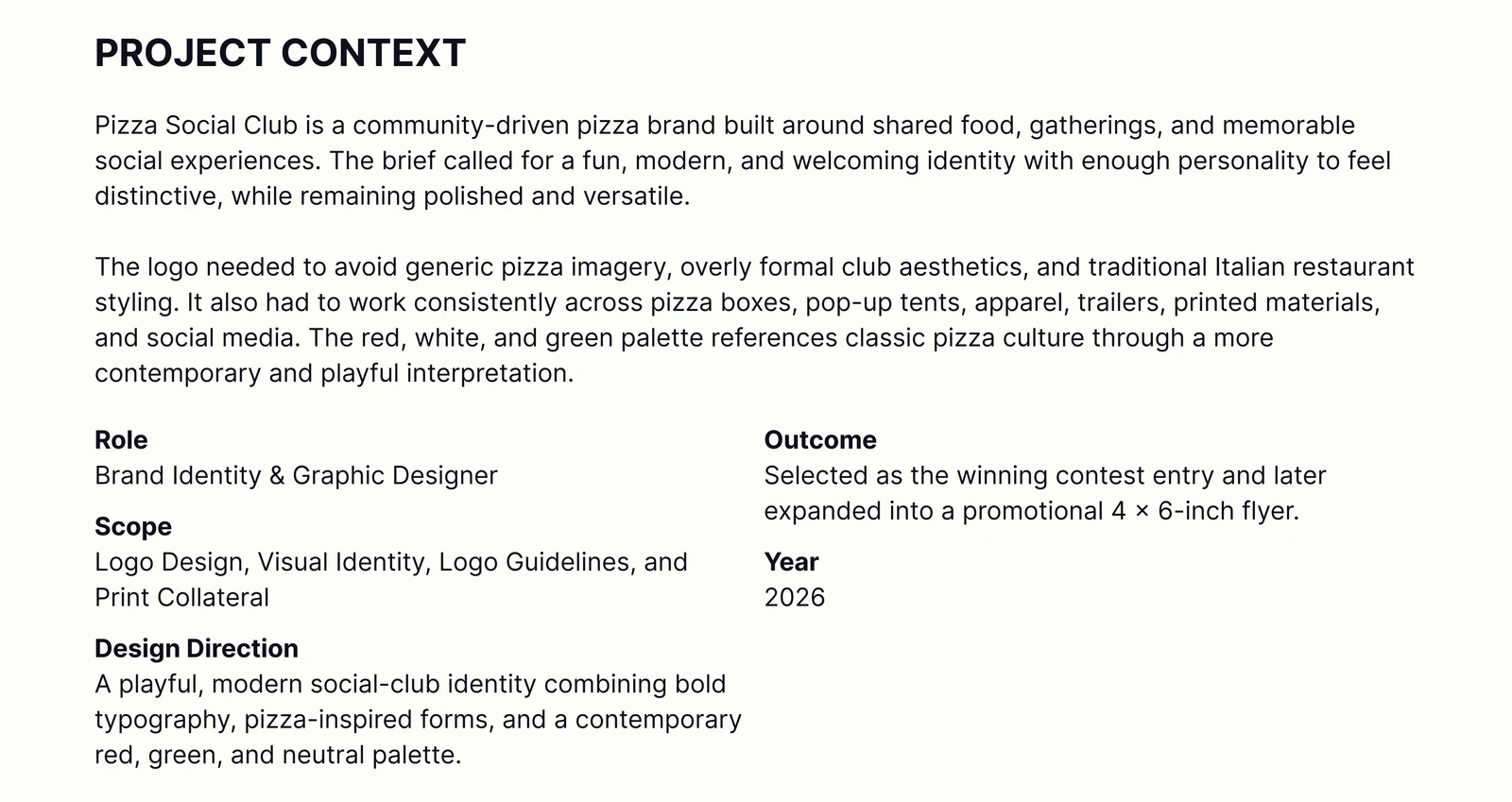
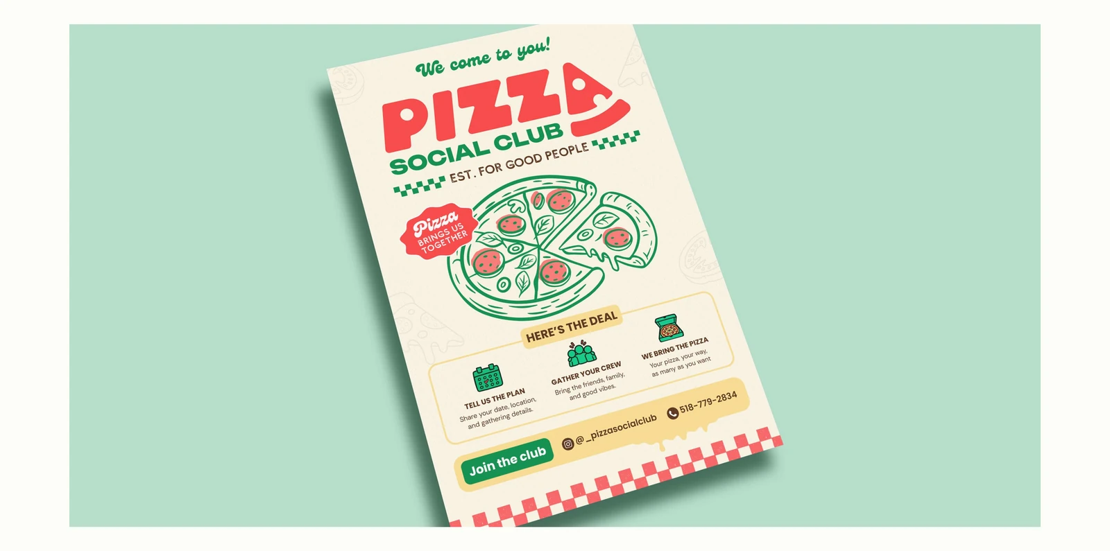
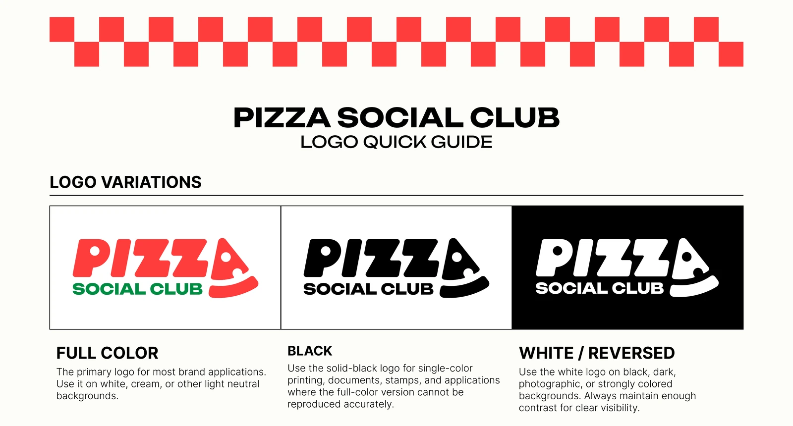
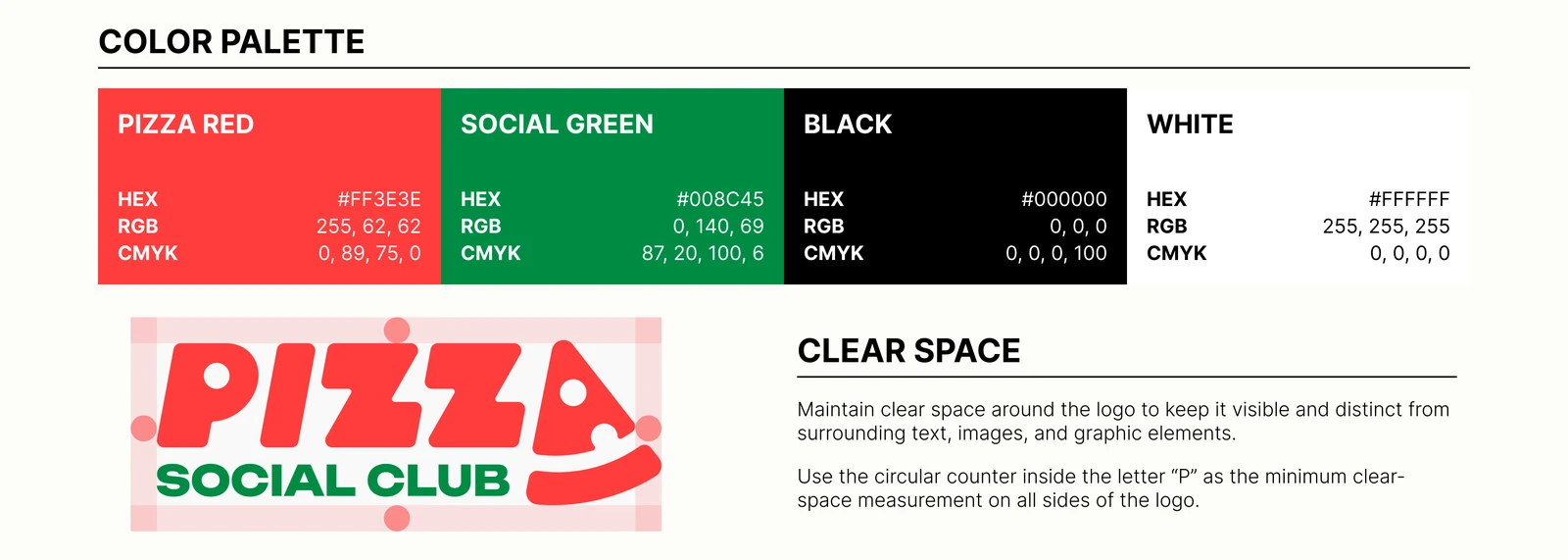
A playful, modern identity for a community-driven pizza brand built around shared food and social gatherings. The winning contest entry was later expanded into a promotional 4 × 6-inch flyer.
Editorial / Brochure Design
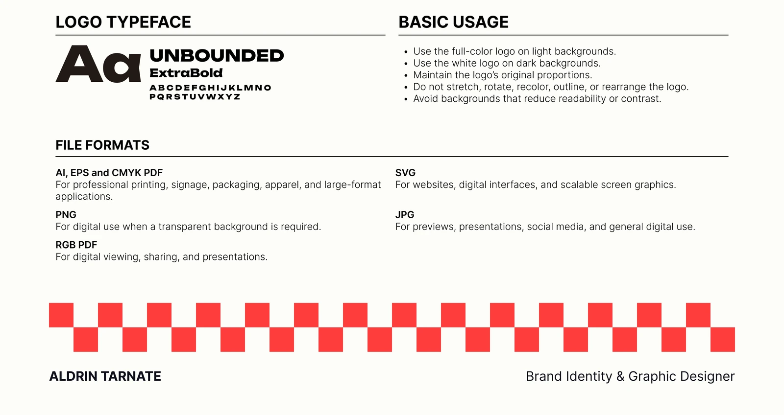
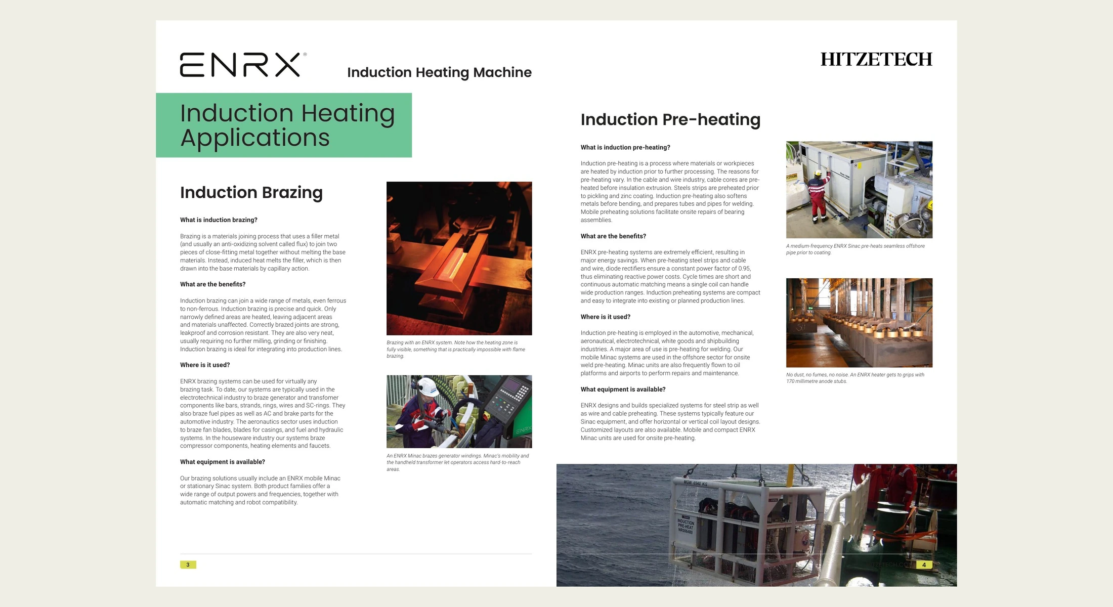
A 52-page company and product brochure for Hitzetech, bringing together an introduction, industrial applications, and detailed product information.
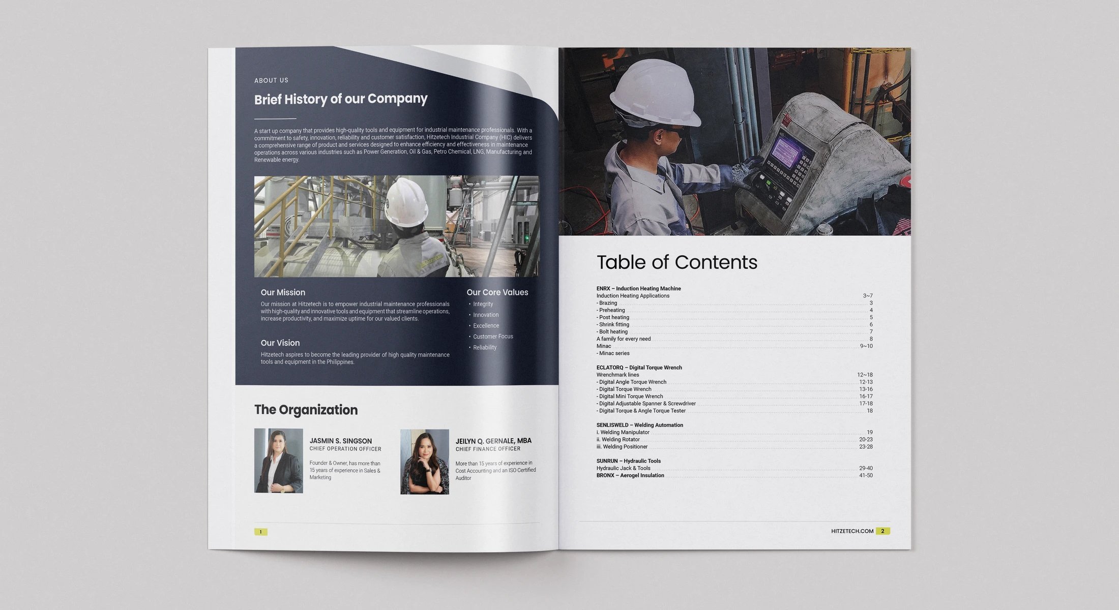
The brochure opens with a company overview and contents page, then moves through industrial applications and detailed product information. This selection shows my personal cover refinement alongside interior spreads from the client-approved brochure. The updated cover retains the approved format; it is not presented as a new client-approved version.
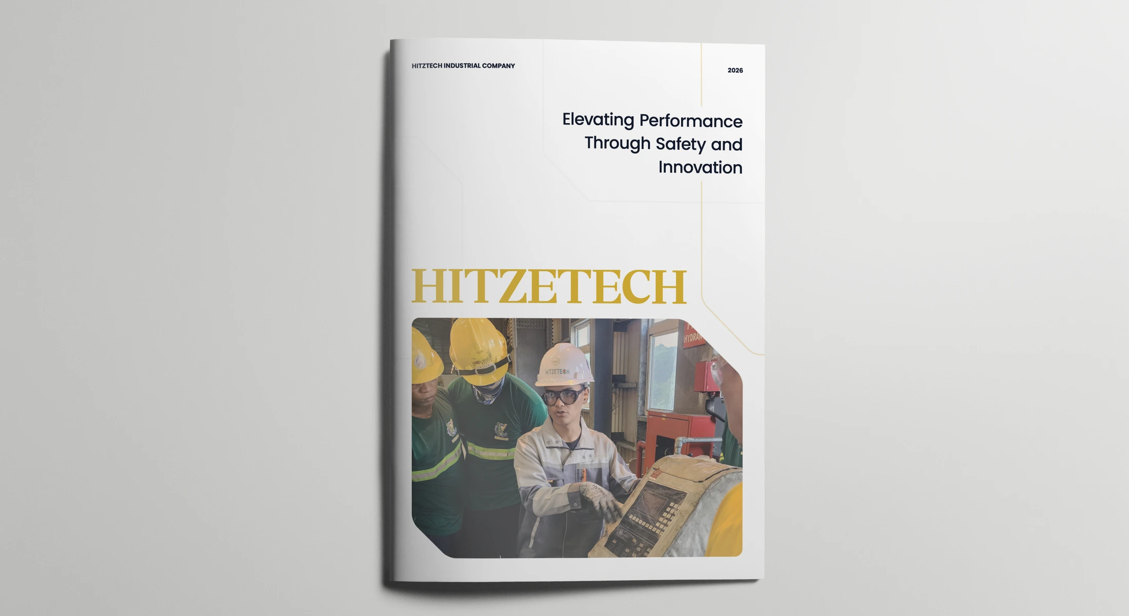
Opening pages orient the reader before the technical and product sections.
Applications, concise subheads and supporting photography give the reader more than one way into the content.
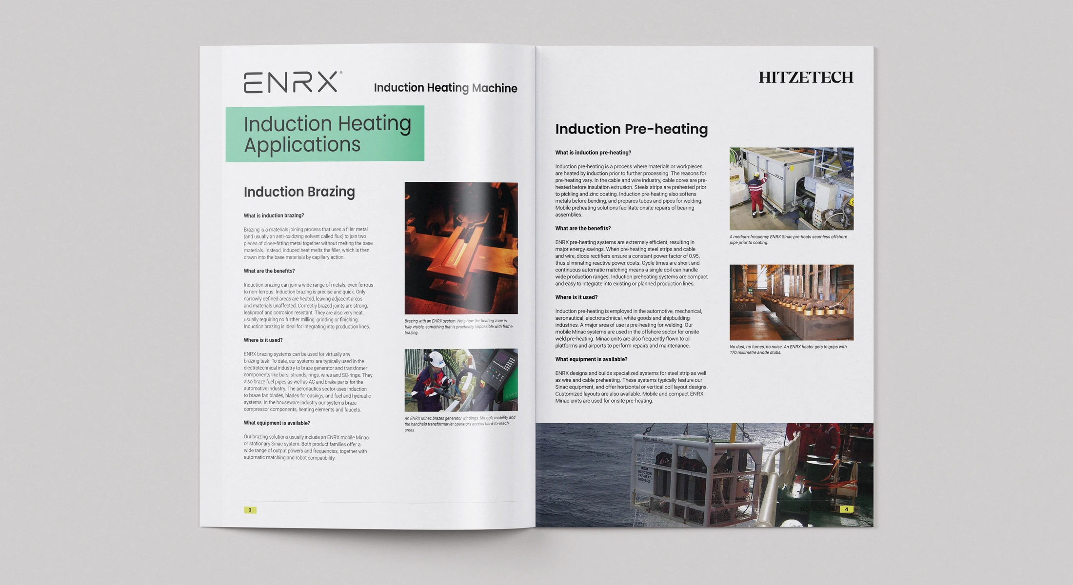
Flat exports let visitors inspect the type, image placement and information density that small mockups can hide.
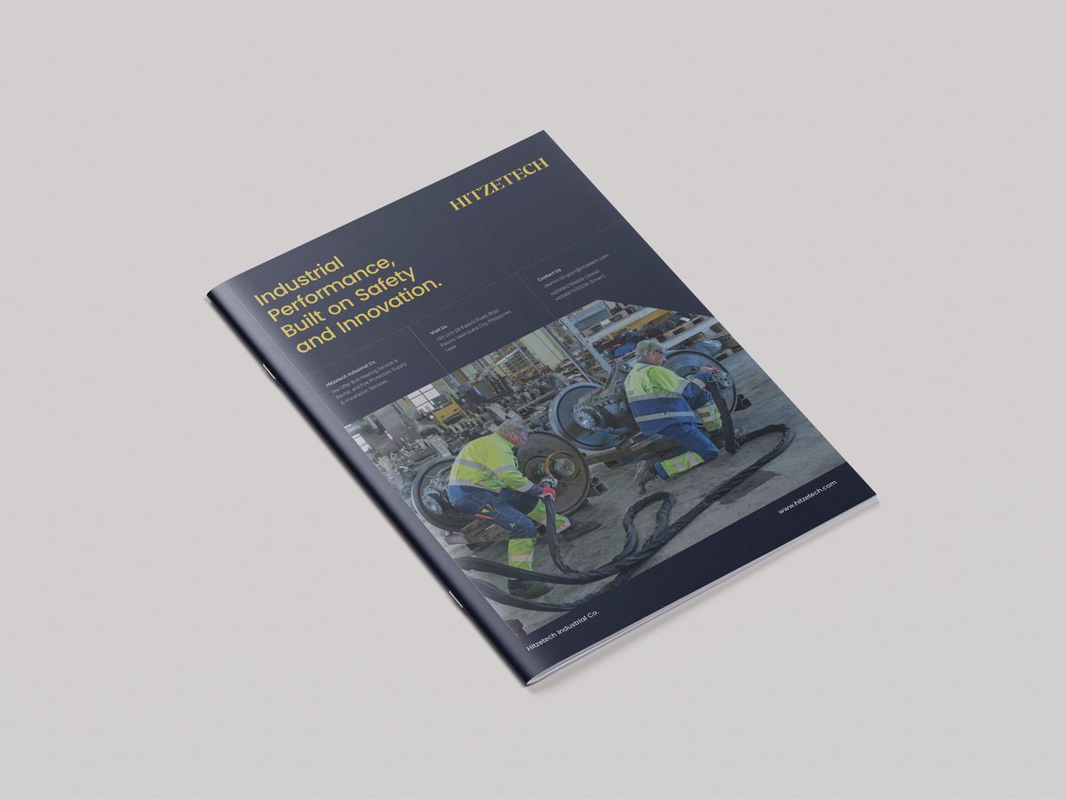
I also explored a darker, image-led cover that puts the industrial setting front and center. The client-approved brochure uses a white cover; my personal refinement of that direction is shown above.
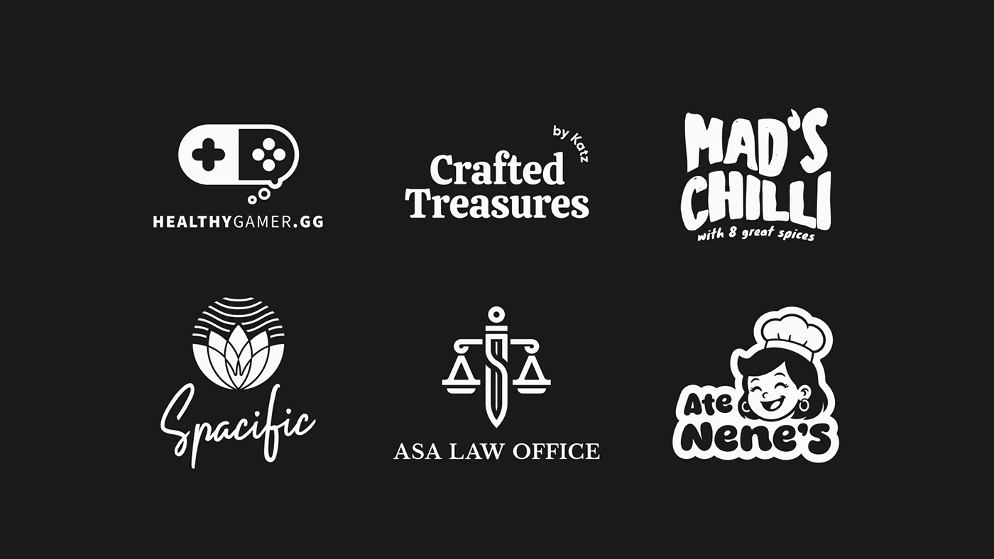
Logo collection
A compact collection of marks designed for distinct voices, industries, and applications.
Social & campaign
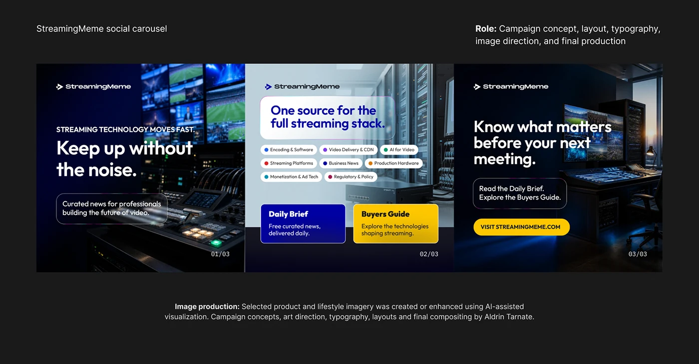
Food campaigns and a LinkedIn carousel, brought together as a selection of digital campaign design.
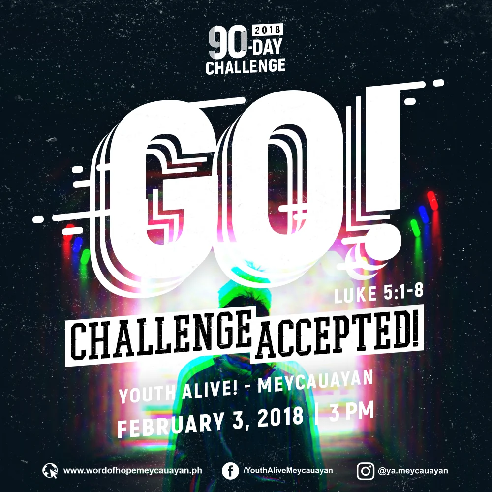
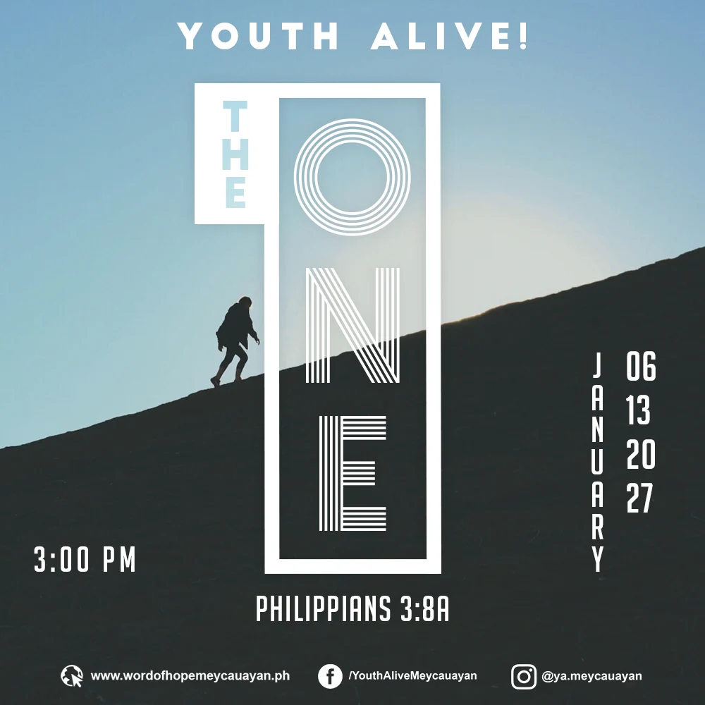
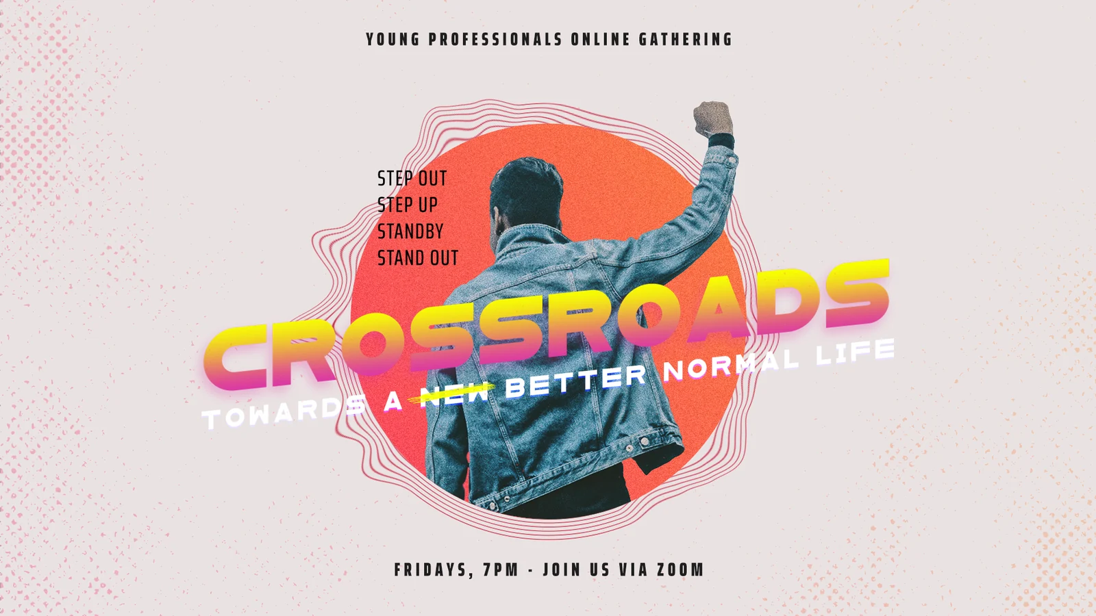
Church event & message art
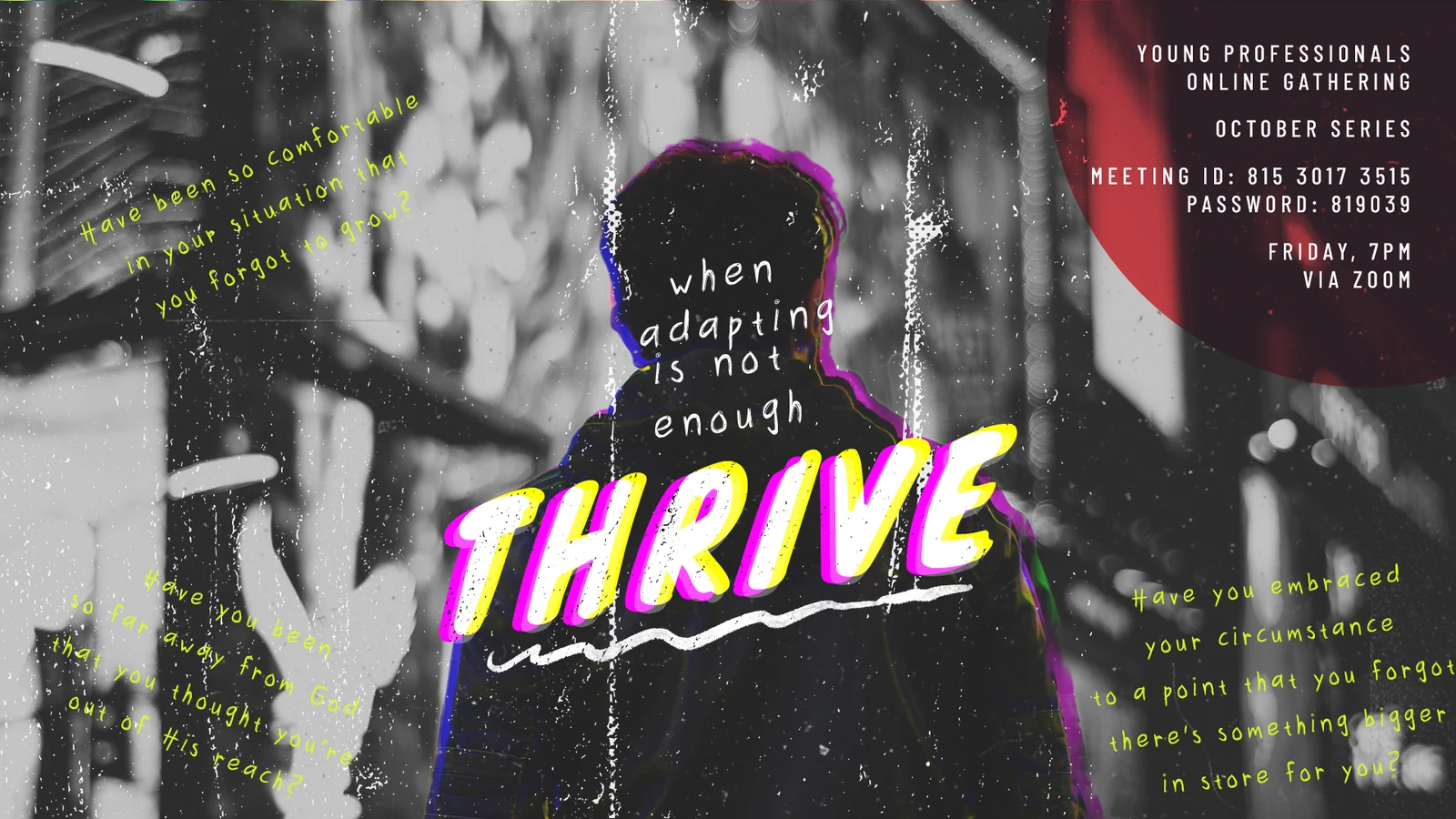
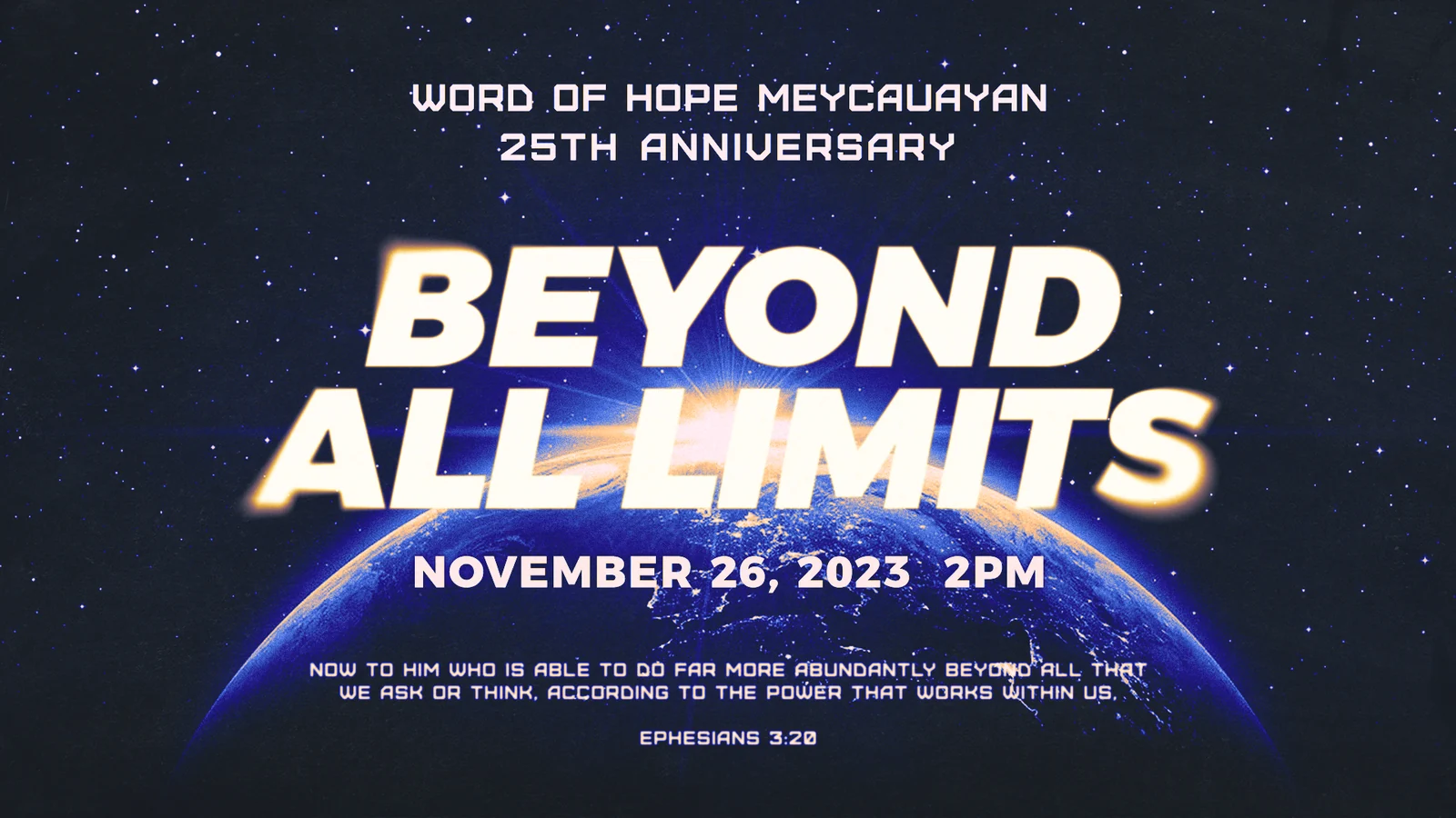
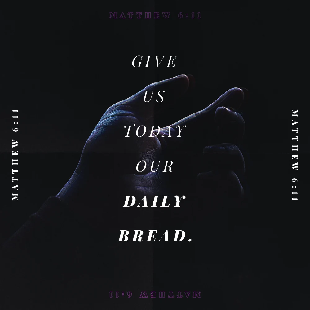
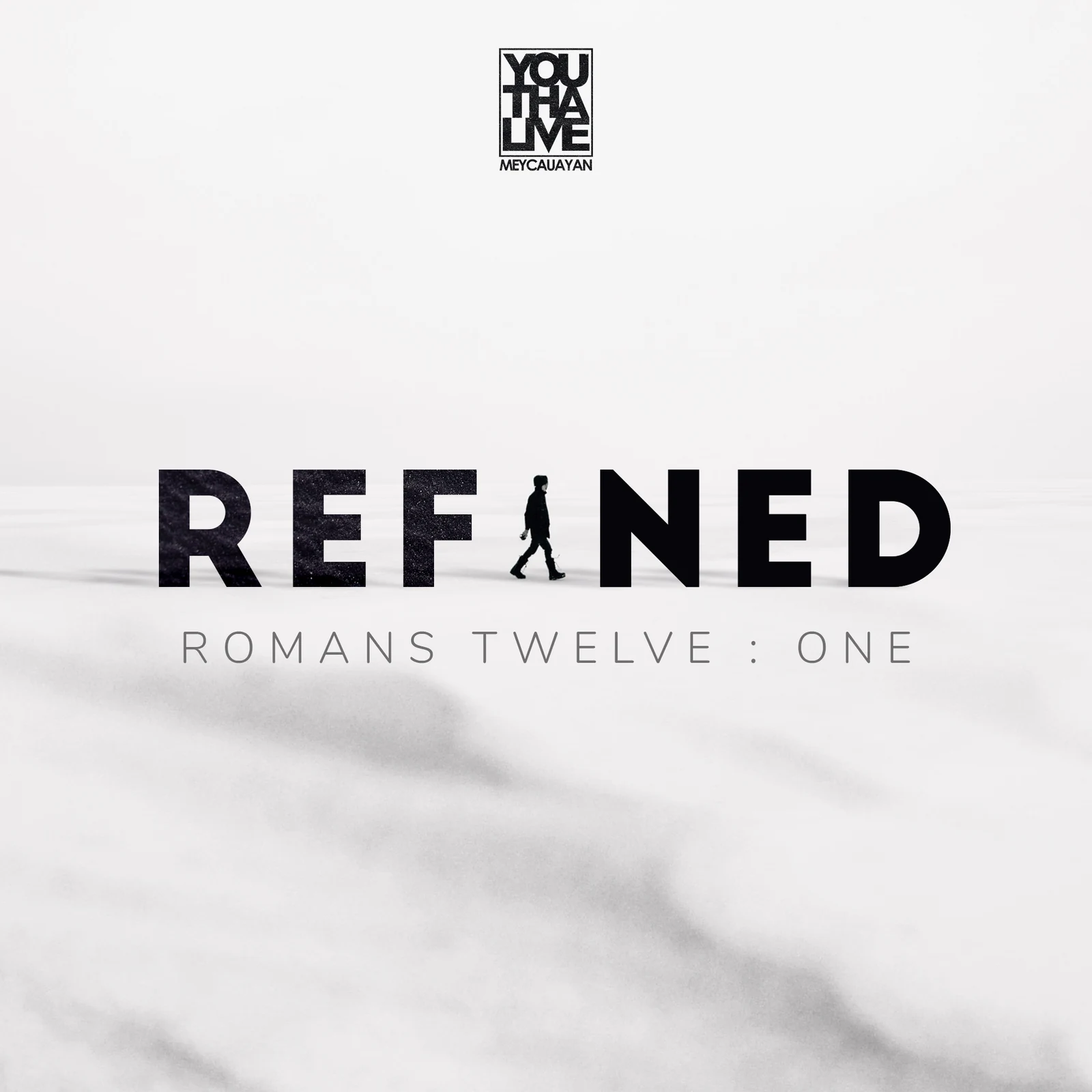
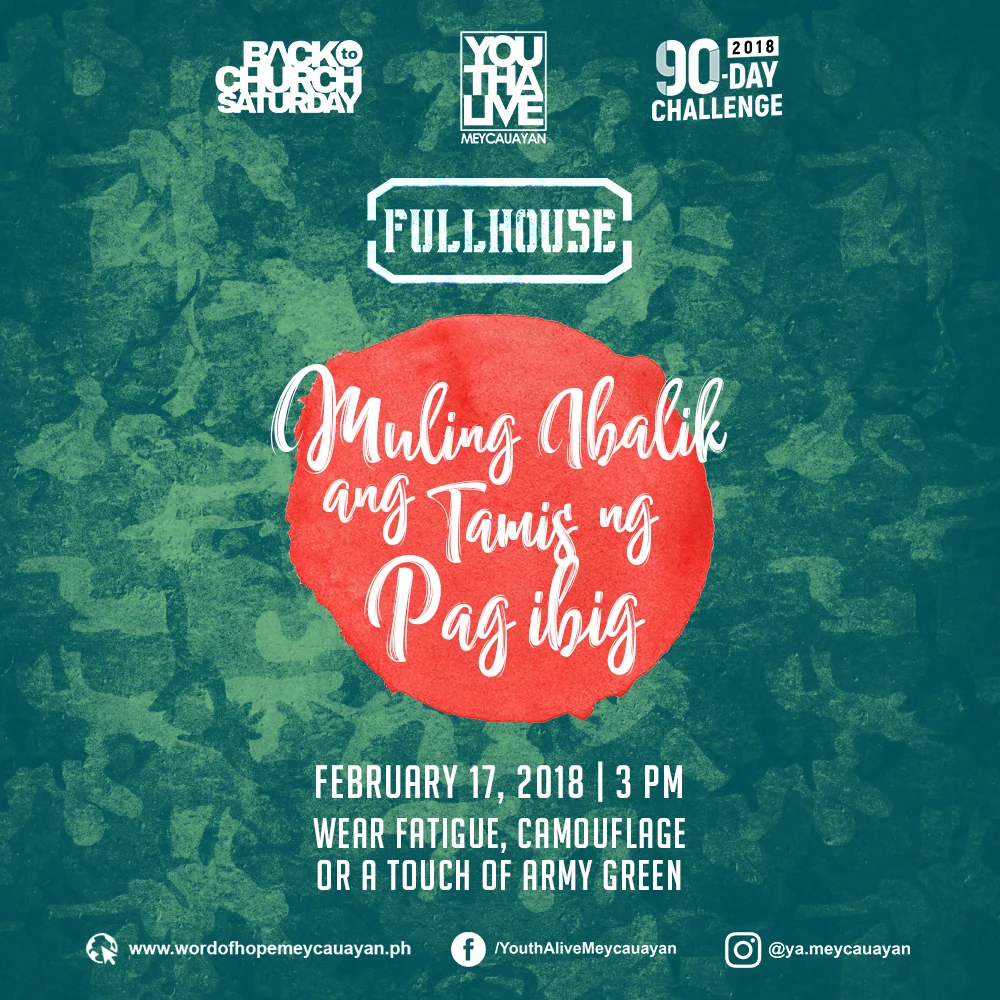
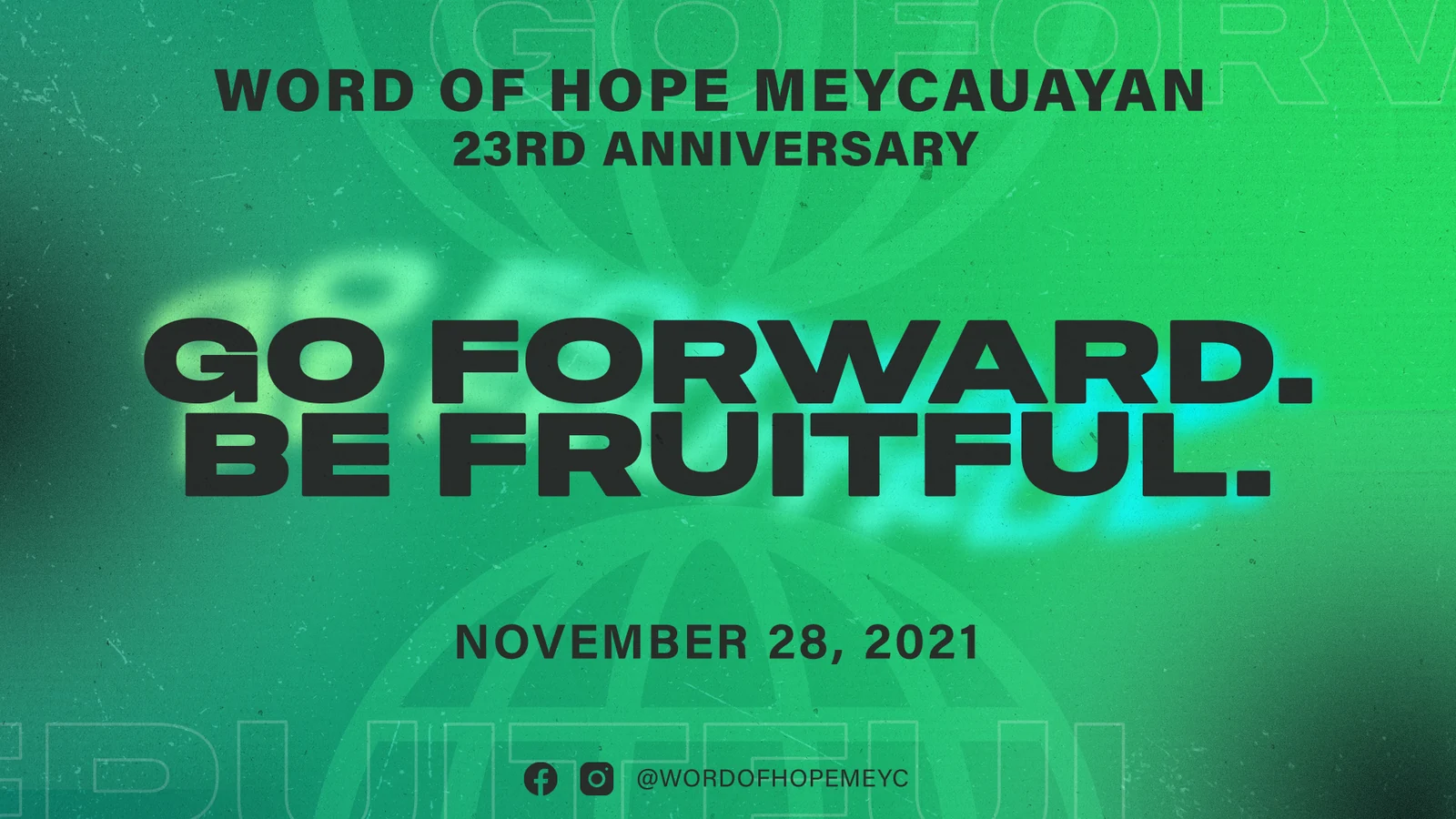
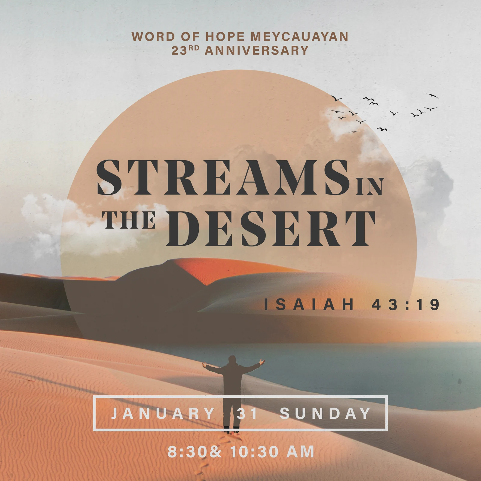
Ten numbered church campaign graphics for events, message series and social formats, preserved in source order.
Email & digital campaigns
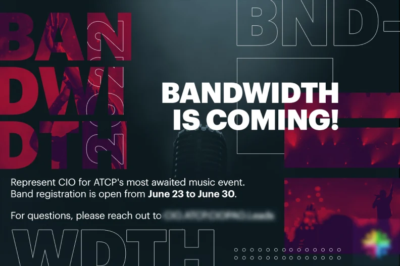
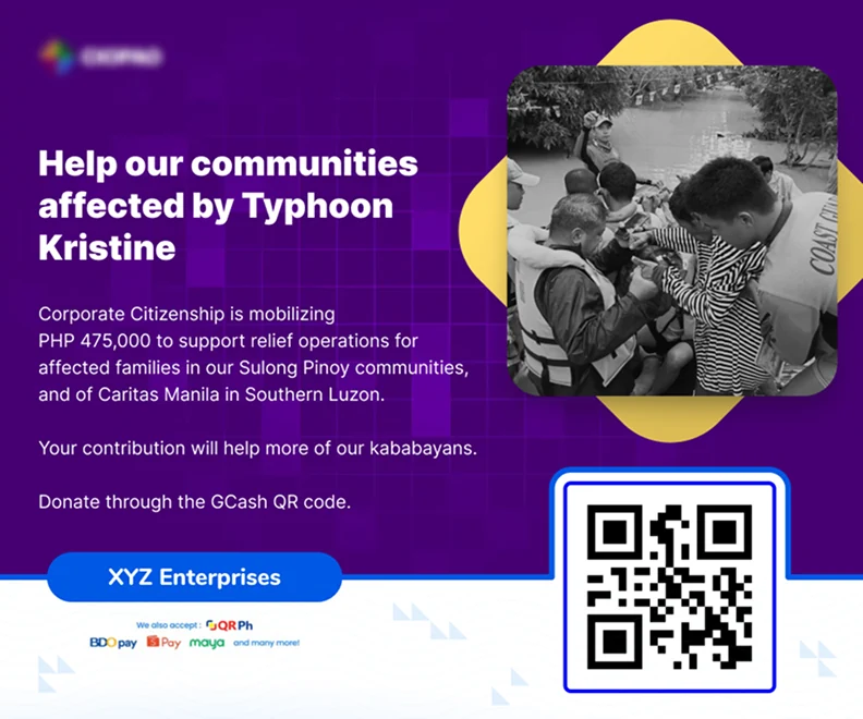
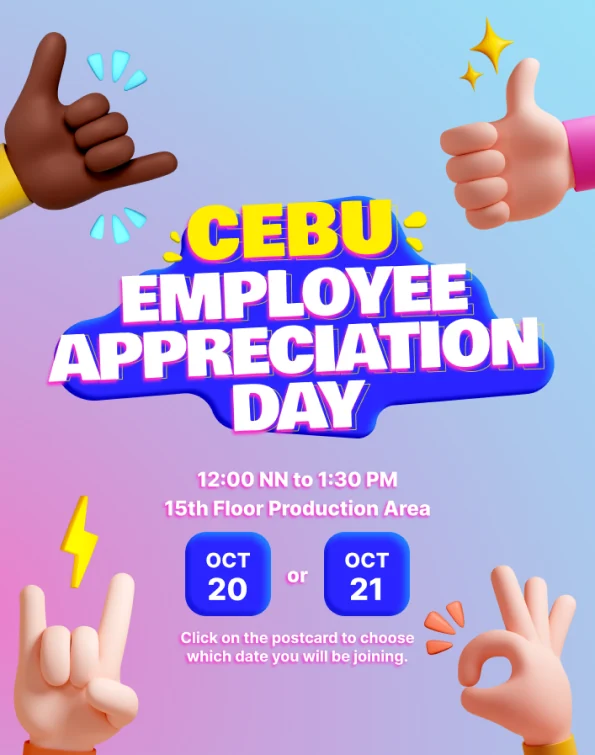
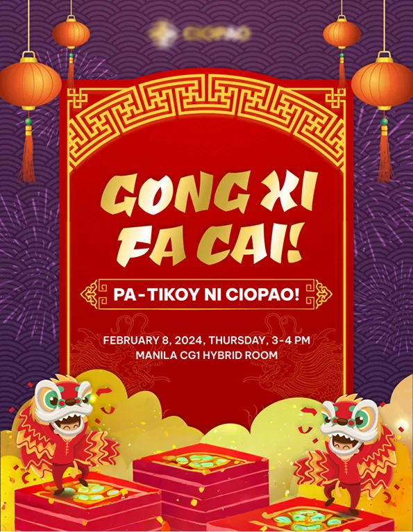
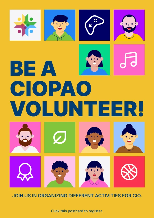
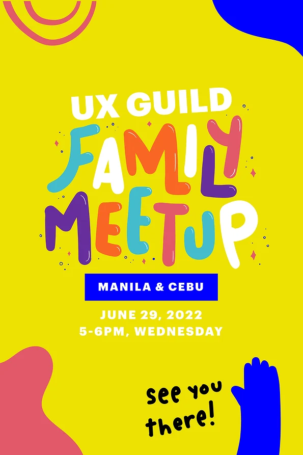
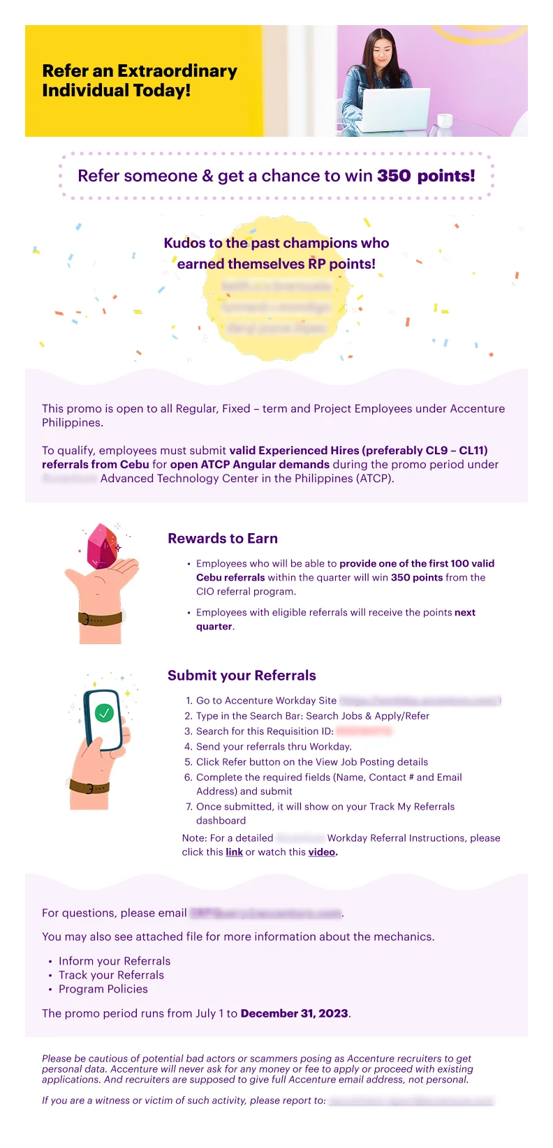
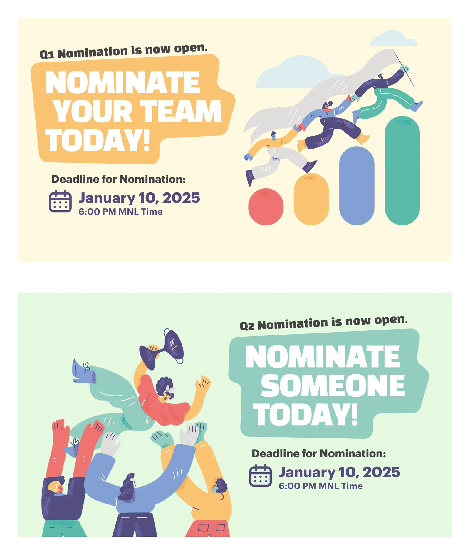
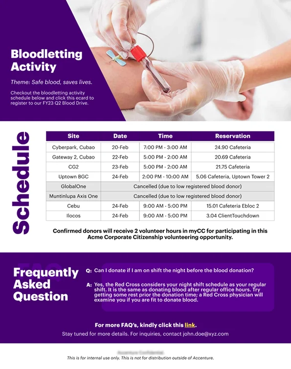
Email campaign designs spanning event announcements, community appeals and internal communications.
Poster art & prints
Expressive poster designs shown in framed settings, with a layer-by-layer motion breakdown.